



Services on Demand
Journal

Article
 English (pdf)
 Article in xml format
 Article references
 Automatic translation
 Send this article by e-mail
Indicators
Related links
-
 Cited by Google
 -
 Similars in Google
Share

 Permalink
The African Journal of Information and Communication
On-line version ISSN 2077-7213Print version ISSN 2077-7205
AJIC vol.36 Johannesburg 2025
https://doi.org/10.23962/ajic.i36.23095
RESEARCH ARTICLES
RETRACTED:How web-interface design impacts task performance, cognitive load, and user experience (UX): An exploration with a cohort of South African university students
André Delwyn Gopal
Lecturer, Digital Arts Department, University of the Witwatersrand, Johannesburg. https://orcid.org/0009-0003-9585-7786
ABSTRACT
THIS ARTICLE WAS RETRACTED BY THE AUTHOR ON 9 FEBRUARY 2026:This study explores how differences in web-interface design can generate variations in users' task performance, cognitive load, and user experience (UX). In the study, a cohort of 32 purposively selected South African university students aged 18-24 was presented with an information-seeking and problem-solving task-calculation of the calories they should consume per day based on their age, gender, height, weight, and activity level-and they were asked to choose among several possible websites/pages to complete the task. A mix of quantitative and qualitative data was collected to explore the participants' web-interface choices, task performance (speed and success), cognitive load, and UX. The majority of participants (84.4%) selected the most visually rich, interactive, tool-based web interface to complete the task, and these participants completed the task faster, with lower cognitive effort and with higher satisfaction, than the participants who chose a site with a less visually compelling and interactive interface. These findings point to the need for disseminators of educational and public-service information targeted at "digital natives" to prioritise the use of visually rich, interactive, tool-based web interfaces for their online materials.
Keywords: web-interface design, task performance, cognitive load, cognitive load theory (CLT), user experience (UX), digital natives, South Africa
1. Introduction
The Internet now underpins daily life across the globe, shaping how individuals access information, communicate, and participate in economic and educational activities. Web design has evolved significantly from the early days of static, text-heavy pages with basic layouts (Berners-Lee, 1999; Webillism, 2024) to today's dynamic, interactive, and visually engaging digital platforms (Paluch et al., 2022). This shift is driven in part by the rise of "digital natives" (George, 2024; Prensky, 2001), who display advanced digital fluency and expect online information to be delivered through intuitive, visually appealing, and interactive interfaces (Paluch et al., 2022; Turner, 2015).
Meanwhile, many South African and African web applications and digital platforms-especially those used in public services and education-continue to rely on online information-delivery formats that are cognitively taxing due to lengthy, unstructured text and poorly optimised layouts (Fang & Holsapple, 2011; Surbakti et al., 2024). These design shortcomings are evident in several South African digital platforms serving public-interest functions. For example, government portals such as the South African Revenue Service (SARS) eFiling system and the Department of Home Affairs online services have historically presented users with dense text, complex navigation structures, and limited interactive guidance. In the health sector, platforms such as the National Department of Health's Knowledge Hub often rely on text-heavy layouts that require users to locate and synthesise information manually.
Similarly, educational platforms-including institutional learning management systems such as Moodle and Ulwazi, as commonly implemented in South African universities-frequently present course materials in lengthy, scroll-intensive formats with minimal visual hierarchy or interactivity. These examples are symptomatic of a broader pattern in which South African and African digital platforms, despite serving critical public functions, may impose unnecessary cognitive demands on users through suboptimal interface design. They risk excluding users who are accustomed to the immediacy, interactivity, and automation of contemporary digital tools (Norman, 2013; Paluch et al., 2022). Young Africans, who are the continent's largest demographic group, will drive Africa's digital transformation and participation in the digital economy, and thus it is essential to understand how web-interface design can be optimised to promote young Africans' engagement with public-interest online content resources.
This study tested the impact of web-interface design paradigms on cognitive load and task efficiency among a cohort of purposively selected South African university students. The participants were given an information-acquisition and problem-solving task-calculation of how many calories they should consume per day based on their age, gender, height, weight, and activity level to achieve a specified weight-loss goal-and were presented with several possible websites/pages to use to complete the task. Data was collected and analysed on study participants' web-interface choices, cognitive load, task performance, task success, and user experience (UX).
The research was grounded in cognitive load theory (CLT), a foundational framework for understanding how individuals process information in digital environments. CLT posits that the capacity of working memory is limited, and the efficiency with which information is processed depends on how cognitive load is managed (Sweller, 2011; Sweller et al., 2011). CLT intersects with the other conceptual tools deployed in the study: UX and usability frameworks. UX emphasises the creation of digital environments that are easy, efficient, and satisfying to use (Norman, 2013). Usability focuses on reducing cognitive friction-barriers that hinder smooth user interaction-by optimising information architecture, visual design, and interactivity (Nielsen, 2012).
While the impact of web-interface design on user experience and cognitive load has been explored in many contexts, limited empirical research has examined these dynamics specifically among young African users (digital natives) engaging with public-interest online content. This study contributes to the literature in three ways. First, it provides empirical evidence from a South African context, addressing the underrepresentation of African user populations in UX and cognitive load research. Second, by allowing participants to freely select from multiple web interfaces representing different design paradigms, the study captures naturalistic choice behaviour rather than relying solely on assigned conditions, offering the ecological validity often absent in controlled usability experiments. Third, the study integrates quantitative performance metrics with qualitative insights into user reasoning, providing a more holistic understanding of how and why young digital natives navigate toward-or away from-particular interface designs. These contributions are intended to inform the design of digital public services and educational resources in African contexts, where user-centred design remains underexplored.
2. Literature review
CLT in digital environments
Intrinsic cognitive load refers to the inherent complexity of the content itself, such as the difficulty of the subject matter or the interrelatedness of concepts (Sweller et al., 2011). For example, learning advanced statistical concepts inherently imposes a higher intrinsic load than reviewing basic arithmetic. Extraneous cognitive load, in contrast, is imposed by the manner in which information is presented. Poorly organised, text-heavy websites can increase unnecessary cognitive demands by requiring users to sift through dense text, search for relevant information, and navigate confusing layouts (Fang & Holsapple, 2011; Faudzi et al., 2024; Kalyuga, 2011). Such design choices divert cognitive resources away from learning or task completion, often resulting in frustration and inefficiency. Germane cognitive load is the mental effort devoted to schema construction, comprehension, and learning. Well-designed, visually rich, and interactive digital interfaces can reduce extraneous cognitive load, thereby freeing up cognitive resources for meaningful processing (Mayer, 2014; Sweller, 2011). Interactive tools, infographics, and clear navigation structures help users to organise and integrate new information more effectively.
CLT posits that the human brain has limited working memory resources, and the way information is presented can either hinder or facilitate learning and task performance (Darejeh et al., 2024; Sweller, 2011; Sweller et al., 2011, 2019). In web design, intrinsic cognitive load relates to the complexity of the content itself, while extraneous cognitive load arises from poor design elements such as cluttered layouts or excessive text (Kalyuga, 2011; Sweller et al., 2019). Germane cognitive load, conversely, is the mental effort that contributes to learning and schema construction, which can be fostered through clear, well-organised, and interactive digital interfaces (Mayer, 2014). Empirical studies have demonstrated that reducing extraneous load through improved information structuring, use of visuals, and interactive elements leads to more efficient cognitive processing and higher user satisfaction (DeStefano & LeFevre, 2007; Skulmowski & Xu, 2022).
Recent developments in CLT have refined its application to digital environments. Sweller et al. (2019) presented an updated model in which germane load is reconceptualised as "germane processing" rather than an additive component of total load, reflecting a more nuanced understanding of how cognitive resources are allocated during learning. Skulmowski and Xu (2022) further extended this work by examining how design factors in digital learning-including interactivity, immersion, and realism-can induce task-irrelevant cognitive load while still promoting engagement and learning, challenging simplistic assumptions about extraneous load reduction. This evolving understanding of cognitive load in digital contexts underscores the importance of web-interface design choices in managing users' cognitive resources (Darejeh et al., 2024).
User experience (UX) and usability principles
Established UX principles, such as Nielsen's heuristics, emphasise system visibility, user control, error prevention, and consistency (Nielsen, 1993). User-centred design prioritises the needs and behaviours of the user throughout the development process (Norman, 2013). Research consistently shows that visual design, interactive elements, and immediate feedback significantly enhance perceived usability and user satisfaction (Hassenzahl & Tractinsky, 2006; Law et al., 2014). Visually appealing interfaces and meaningful interactivity can reduce cognitive friction, making digital experiences more intuitive and enjoyable (Garrett, 2011). Recent scholarship has continued to refine UX measurement and evaluation practices. A systematic review of Conference on Human-Computer Interaction (CHI) proceedings (2019-2022) identified ongoing concerns about measurement validity in UX research, emphasising the need for clear theoretical grounding when selecting and reporting survey instruments (Perrig et al., 2024). Nielsen's foundational usability heuristics, originally developed in 1993 were updated in 2024 with expanded explanations and contemporary examples, demonstrating their continued relevance for modern interface design (Nielsen, 2024). Research continues to demonstrate that visual design, interactivity, and immediate feedback significantly enhance perceived usability and user satisfaction across diverse digital contexts (Ntoa, 2024; Priyadarshini, 2024).
Web-interface design paradigms and their evolution
Web design has evolved from static, text-heavy pages in the early Internet era to dynamic, responsive, and visually rich experiences today (Berners-Lee, 1999; Paluch et al., 2022). Early websites offered limited engagement and accessibility, often relying on dense text and basic navigation. In contrast, modern web design trends favour minimalism, visual storytelling, interactive tools, and mobile-first layouts that adapt seamlessly to various devices (Beaird & George, 2020; Paluch et al., 2022; Webillism, 2024).
Characteristics and expectations of young adults as digital users
Today's young adults, who came of age during the digital era, are among the "digital natives" who have distinct media consumption habits and expectations for digital interfaces (Prensky, 2001; Turner, 2015). This demographic values speed, visual appeal, personalisation, and interactivity in online environments (Levene, 2011; Paluch et al., 2022). Research suggests that digital natives have shorter attention spans than older demographics and are less tolerant of slow or poorly designed websites (George, 2024; Turner, 2015). They also tend to prefer interfaces that provide immediate feedback and streamlined navigation (Content Science, 2025; George, 2024; Raptis et al., 2013). Studies indicate that the cognitive processing styles of young adults are well-suited to visually rich, interactive platforms, which align with their expectations for efficiency and engagement (Levene, 2011; Paluch et al., 2022).
Human-computer interaction for development (HCI4D)
Human-computer interaction for development (HCI4D) is a subfield of HCI that focuses on the design, evaluation, and implementation of interactive computing technologies in development contexts, particularly in the Global South (Ho et al., 2009). HCI4D scholarship emphasises that effective digital systems must account for local contexts, including infrastructure constraints, cultural factors, literacy levels, and user expectations that may differ from those in high-income settings (Anokwa et al., 2009; Dell & Kumar, 2016). A central tenet of HCI4D is that access to technology alone is insufficient for meaningful digital inclusion; the usability and contextual appropriateness of digital interfaces fundamentally shape whether users can derive value from digital systems (Toyama, 2015).
In African contexts, HCI4D research has examined the design of mobile applications, e-government services, and educational technologies, often highlighting mismatches between interface designs developed in Western contexts and the needs of African users (Bidwell, 2016; Wyche & Steinfield, 2016). Recent work has called for greater attention to user-centred design principles in African digital public services, noting that poorly designed interfaces can exclude users and undermine the potential of digital transformation initiatives (Boateng et al., 2011; Owusu et al., 2022). This body of literature provides a framework for understanding how interface design choices in South African digital platforms may differentially affect user engagement and task performance.
3. Research design
Aim and objectives
This study empirically investigated the impact of web-interface design on cognitive load and task efficiency among a group of South African university students. The study objectives were: to assess and compare the cognitive load experienced by the students when interacting with optimal and less-optimal web-interface designs; to assess and compare task completion time and success rates for the students when interacting with optimal and less optimal web-interface designs; and to explore the students' subjective preferences, perceptions of usability, and satisfaction with optimal and less-optimal web-interface designs.
Research questions
The study's two overarching research questions were:
• RQ1: How do different web-interface designs differentially impact the cognitive load, task completion time, and task success rates of respondents during information acquisition and problem-solving tasks?
• RQ2: What are the subjective preferences, perceived usability, and overall satisfaction of respondents regarding different web-interface designs for information acquisition and task completion?
Hypotheses
The study's hypotheses were:
• H1 - Cognitive load: The study participants will report significantly lower cognitive load when interacting with visually rich, interactive, tool-based web interfaces compared to less visually rich, interactive, tool-based interfaces for equivalent information acquisition and problem-solving tasks.
• H2 - Task efficiency: The study participants will exhibit significantly faster task-completion times and higher task success rates via visually rich, interactive, tool-based web interfaces compared to less visually rich, interactive, tool-based interfaces.
• H3 - Preference and satisfaction: The study participants will express significantly stronger preference for, higher perceived usability of, and greater overall satisfaction with visually rich, interactive, tool-based web interfaces compared to less visually rich, interactive, tool-based interfaces.
Participants
A convenience sample of 32 young adults (aged 18-24) was recruited from the University of the Witwatersrand in Johannesburg. Recruitment was conducted through random in-person approaches in common campus areas, with efforts to ensure diversity in gender and academic background within the age range, so as to represent the broader population of digital natives. The inclusion criteria were as follows: aged between 18 and 24 years; fluent in English; normal or corrected-to-normal vision; and regular Internet use (minimum: daily use for at least five years). The exclusion criterion was: existence of any self-reported cognitive or physical impairment that might affect web-interface interaction. All participants provided written informed consent prior to participation, in accordance with institutional ethical guidelines and the ethical clearance certificate (H25/08/22).
Data collection
Approach
This study adopted a mixed-methods approach, integrating quantitative and qualitative data. Quantitative measures captured objective performance, cognitive load, and usability metrics, while qualitative data captured user perceptions, motivations, and more nuanced reasons behind design preferences. The research used an observational-experimental design that allowed for participants to be given a task and for their choices, actions, performance, and preferences to be observed and measured, including via self-reporting mechanisms.
Task
Participants were seated individually at a PC workstation in a university lecture laboratory. The testing took place in a controlled environment with only the participant and the researcher present to minimise distractions and ensure standardised conditions across all sessions. Participants were given the following task instruction: "Accurately calculate how many calories you should eat per day to lose 6 kilograms, based on your assigned metrics (e.g., age, gender, height, weight, activity level; all in metric units)" Participants were then directed to a selection screen on the PC with nine website/page options already open, each representing a different approach to presenting calorie calculation information. They were instructed to review the options and select the site/page they believed would best help them to complete the calorie-calculation task. After making their selection, participants interacted solely with the chosen site/page to perform the calculation. Participants then submitted their final calculated daily calorie target.
Website/page categorisation and description
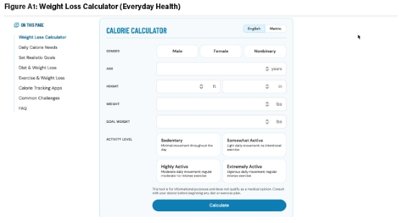
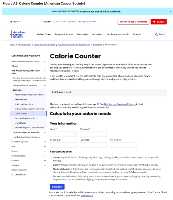
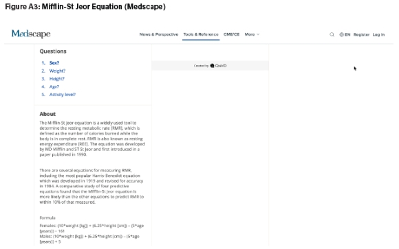
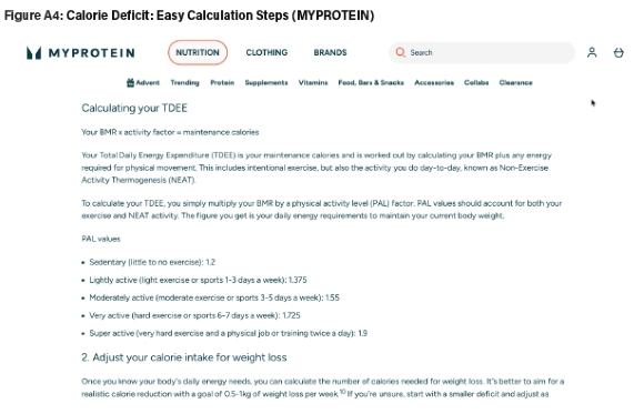
Table 1 presents the nine websites/pages made available to participants, categorised by interface-design type, with their URLs and brief descriptions. The inclusion of only one well-designed calculator tool alongside one less optimally designed calculator and seven text-based information sites was a deliberate methodological choice. The subject matter-calorie calculation for weight loss-is a domain characterised by dense informational content and a relative scarcity of well-designed interactive tools. The Everyday Health calculator represents approximately the best-in-class interface currently available for this task, making it a meaningful benchmark. By maximising the number of less visually appealing and text-heavy alternatives, the study design created conditions under which participants' gravitation toward the well-designed interface-if it occurred-would be noteworthy, as it would require them to identify and select this option from among a larger pool of less optimal alternatives.
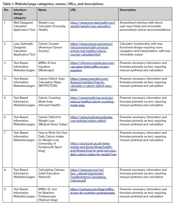
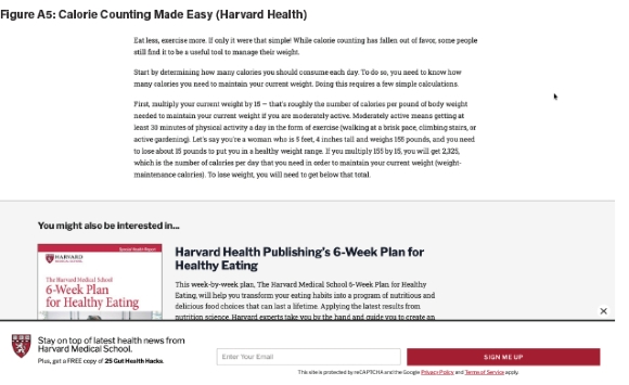
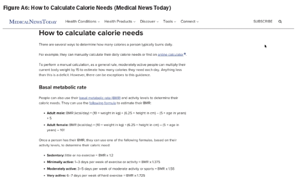
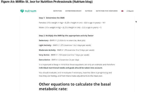
All the websites/pages provided the information necessary to complete the assigned calorie calculation task. The primary differences between them lay in presentation style, degree of interactivity, and modalities of use, enabling isolation of the design paradigm as the variable of interest. Screenshots of each web interface are provided in the Appendix.
Data collection methods
Data collection comprised quantitative logging metrics, subjective measures, and qualitative protocols as detailed in Table 2.
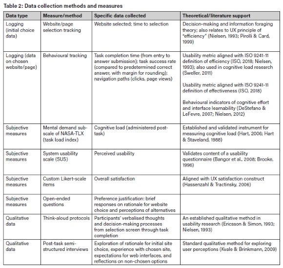
For the initial choice analysis, two primary data points were logged: (1) the website/page selected by each participant, recorded as a categorical variable corresponding to the nine available options; and (2) the time to selection, measured in seconds from the moment the selection screen was displayed to the moment the participant confirmed their choice. Selection was recorded via direct researcher observation, and timing was captured using a stopwatch. Exploratory browsing behaviour on the selection screen (i.e., whether participants visually scanned or briefly clicked into multiple options before committing to a choice) was noted qualitatively where observed, but was not systematically coded as a quantitative variable.
Data analysis
Variables
Table 3 presents the independent and dependent variables examined in this study.
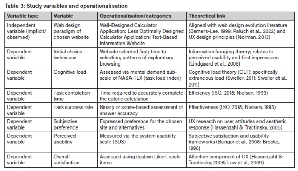
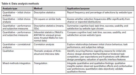
Table 4 outlines the analytical approaches employed for quantitative, qualitative, and mixed-methods integration.
4. Results
Participant demographics
A total of 32 participants completed the study. All participants were university-level young adults recruited from the University of the Witwatersrand, aged between 18 and 24 years (M = 21.34, SD = 1.80), confirming alignment with the target demographic. Gender distribution was as follows: 15 females (46.9%), 15 males (46.9%), and one participant identified as "Other" (3.1%). Self-reported daily Internet usage ranged from 7.0 to 11.5 hours per day (M = 9.23, SD = 1.12), indicating that all participants were highly regular Internet users consistent with the inclusion criteria.
Initial website choice analysis
Distribution of choices
Participants could select from three website categories: the Well-Designed Calculator Tool (Everyday Health Weight Loss Calculator), the Less Optimally Designed Calculator Tool (American Cancer Society Calorie Counter), and the Text-Based Information Website (no participants selected any of the seven text-based sites). The distribution of initial website choices is presented in Table 5.
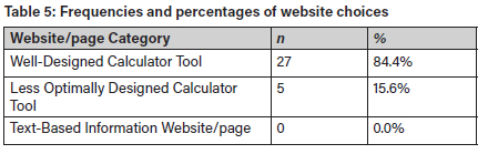
As shown in Table 5, the vast majority of participants (84.4%, n = 27) initially chose the Well-Designed Calculator Tool, while a smaller proportion (15.6%, n = 5) opted for the Less Optimally Designed Calculator Tool. Notably, no participants selected any of the Text-Based Information Website/pages, indicating a strong collective preference for calculator-based tools over text-heavy alternatives for the calorie calculation task.
Time to selection
The mean time to selection across all participants was 182 seconds (SD = 91.5 seconds). When examining the time to selection by chosen category, participants who selected the Well-Designed Calculator Tool made their choice, on average, more quickly (M = 171.1 seconds, SD = 68.4 seconds, n = 27) compared to those who chose the Less Optimally Designed Calculator Tool (M = 223 seconds, SD = 115.4 seconds, n = 5). This suggests that the perceived ease of use or immediate utility of the Well-Designed Calculator Tool may have facilitated a faster initial decision.
Qualitative insights on choice rationale
Analysis of think-aloud protocols and post-study interviews revealed consistent themes underlying participants' website-interface selection behaviour. Four key themes emerged: visual immediacy and decisiveness; preference for efficiency and automation; avoidance of text-heavy interfaces; and alignment with digital-native expectations.
Visual immediacy and decisiveness
Participants were highly responsive to web-interfaces that immediately presented a recognisable calculator tool, enabling them to make quick and confident choices. The presence of a clear input interface was a primary factor in initial selection. As one participant stated: "this one [Everyday Health] looks like it has a calculator straight away. The others are just articles, too much reading" According to another participant: "I'm going with the first one [Everyday Health]" These statements indicate a preference for direct functionality that reduces the need for extensive initial exploration.
Preference for efficiency and automation
The motivation to avoid unnecessary reading and manual computation was strongly articulated by participants. They consistently expressed a desire for tools that provided immediate feedback and automated the calculation process. As one participant noted: "I could see the calculator right there, which is exactly what I needed. The other sites seemed like they would involve a lot of reading and manual calculations, and I just wanted an answer." This sentiment was echoed by another participant, who appreciated the automated process: "Yeah, it was really easy. I just put in my numbers and it gave me the answer. No maths needed, which is great. The other sites looked like they'd make me do the maths myself, which is a pain."
Avoidance of text-heavy interfaces
Text-based web interfaces were consistently dismissed as unsuitable for the task, indicating a low tolerance for complexity among participants. They expressed reluctance to engage with sites that required parsing large amounts of text or performing calculations manually. As one participant stated: "The ones full of text were a definite no. Too much effort" Another participant conveyed frustration with such interfaces, saying, "If I have to read a whole article and then do maths, I'm probably just going to close the tab and find something else."
Alignment with digital-native expectations
Participants valued clarity, visual appeal, and a streamlined experience. The well-designed calculator tool was frequently described as being clean and straightforward, contrasting with the "cluttered" or less intuitive design of the alternative calculator and, especially, of the text-based sites. This reflects broader expectations among young adults for online experiences to be quick, intuitive, and visually engaging. As one participant summarised, "I think for us [young people], we just expect things to be quick and easy online, and if we're presented with boatloads of information, we know we can find a tool on another site or the same information that's just laid out much better, and we simply navigate away from the information overload."
The qualitative data highlights a pronounced preference for interfaces that offer immediate, automated solutions and minimise the need for manual processing. Participants sought to offload cognitive effort onto the design and/or tool, aligning with their expectations as digital natives for rapid, low-friction interactions.
Findings from hypothesis-testing
Hypothesis 1
As outlined above in section 3 on "Research design" the study's H1 was as follows: The study participants will report significantly lower cognitive load when interacting with visually rich, interactive, tool-based web interfaces compared to less visually rich, interactive, tool-based interfaces for equivalent information acquisition and problem-solving tasks. Cognitive load was quantitatively assessed using the mental demand sub-scale of the NASA-TLX. Descriptive statistics, summarised in Table 6, show that participants using the Well-Designed Calculator Tool reported a significantly lower mean mental demand score (M = 10.56, SD = 2.67) compared to those using the Less Optimally Designed Calculator Tool (M = 31.20, SD = 4.89).

A Welch's t-test confirmed a highly significant difference in mental demand between the two groups (t(4.3) = -10.61, p < .001). This result provides strong support for Hypothesis 1, demonstrating that participants experienced significantly lower cognitive load when interacting with the more visually rich, interactive, tool-based website. Qualitative data corroborated the quantitative findings on cognitive load. Two themes emerged regarding cognitive effort: reduced mental effort with the well-designed tool; and perceived burden of alternatives.
To assess the statistical significance of this difference, a Welch's t-test was conducted, accounting for the unequal group sizes and variances. The analysis showed a highly significant difference in task completion time between the groups (t(5.15) = -10.47, p < .001). These findings strongly support Hypothesis 2 with respect to task completion time, indicating that task completion was significantly faster on the Well-Designed Calculator Tool compared to the Less Optimally Designed Calculator Tool.
Regarding task success, both groups achieved a 100% success rate. All 27 participants who used the Well-Designed Calculator Tool successfully completed the task, as did all five participants who used the Less Optimally Designed Calculator Tool. Due to the lack of variance (all participants in both groups succeeded), a chi-square test was not applicable. Consequently, while all participants completed the task successfully, Hypothesis 2 with respect to task success rates could not be differentiated by this dataset, as both calculator tools allowed for successful completion. This outcome is likely attributable to the relatively straightforward nature of the calorie calculation task and the provision of necessary information on both calculator sites. Qualitative data on task efficiency revealed two themes: streamlined task execution with a well-designed tool; and anticipated inefficiency of alternatives.
Streamlined task execution with a well-designed tool
Participants who used the Well-Designed Calculator Tool described the task process as fast and nearly effortless. The immediacy of results and lack of unnecessary steps contributed to rapid completion. In the words of one participant: "That was super-fast. It gave me the exact number I needed"
Anticipated inefficiency of alternatives
Participants anticipated that alternative interfaces would require more time and steps. The Less Optimally Designed Calculator Tool was perceived as more cumbersome, and text-based sites were expected to be highly time-consuming: "The other calculator site [American Cancer Society] looked more cluttered, and I wasn't sure if it would give me exactly what I needed without extra steps"
Reduced mental effort with the well-designed tool
Participants who used the Well-Designed Calculator Tool consistently described the experience as requiring minimal cognitive effort. The automation of calculations and the clarity of the interface eliminated the need for mental computation or information synthesis. As one participant noted: "I just put in my numbers and it gave me the answer. No maths needed, which is great."
Perceived burden of alternatives
Participants perceived that alternatives-particularly text-based sites-would impose substantial cognitive demands. Even without using these sites, participants anticipated that engaging with them would require effortful reading and manual calculation. According to one participant: "If I have to read a whole article and then do algebra, I'm probably just going to close the tab and find something else"
Hypothesis 2
H2 was as follows: The study participants will exhibit significantly faster task-completion times and higher task success rates via visually rich, interactive, tool-based web interfaces compared to less visually rich, interactive, tool-based interfaces. With respect to task-completion time, quantitative descriptive statistics revealed a notable difference between the two groups, as presented in Table 7. Participants using the Well-Designed Calculator Tool completed the task in an average of 52.44 seconds (SD = 12.06), whereas those using the Less Optimally Designed Calculator Tool took significantly longer, with an average completion time of 135 seconds (SD = 21.21).

Hypothesis 3
H3 was as follows: The study participants will express significantly stronger preference for, higher perceived usability of, and greater overall satisfaction with visually rich, interactive, tool-based web interfaces compared to less visually rich, interactive, tool-based interfaces. With respect to perceived usability, application of the quantitative system usability scale (SUS) revealed clear distinctions between the groups. As presented in Table 8, the Well-Designed Calculator Tool received a significantly higher mean SUS score (M = 89.27, SD = 2.33) compared to the Less Optimally Designed Calculator Tool (M = 76.40, SD = 3.36). Similarly, overall satisfaction, rated on a 1-7 Likert scale, was significantly higher for the Well-Designed Calculator Tool (M = 6.52, SD = 0.66) than for the Less Optimally Designed Calculator Tool (M = 5.40, SD = 0.55).

Welch's t-tests confirmed these significant differences: SUS scores (t(4.3) = 7.25, p < .01) and overall satisfaction (t(4.2) = 3.55, p < .05) were both significantly higher for the Well-Designed Calculator Tool. These findings strongly support Hypothesis 3, indicating that young adults expressed a significantly stronger preference, higher perceived usability, and greater overall satisfaction for the more visually rich, interactive, and tool-based web interface. Qualitative data on preference, usability, and satisfaction revealed three themes: perceived superior usability of the well-designed tool; challenges with the less optimally designed tool; and explicit preference for automation and immediacy.
Perceived superior usability of the well-designed tool
Participants consistently highlighted the exceptional usability and clarity of the Well-Designed Calculator Tool. They praised its visual simplicity, the immediate availability of the calculator interface, and the directness of the process. The primary usability theme was the ease with which participants could complete the task-simply entering numbers and receiving an instant, precise answer. The lack of unnecessary steps or distractions was frequently mentioned as a major advantage. As one participant stated: "This one [Everyday Health] looks like it has a calculator right away [...]. Oh, perfect, just plug in the numbers here [...]. Done. That was super-fast. It gave me the exact number I needed" Participants reported almost no challenges using this site. The process was described as "super-fast" "clean" and "straightforward" with minimal effort required to achieve task success. The interface's clarity and automation effectively eliminated cognitive friction and made the experience feel effortless: "I could see the calculator right there, which is exactly what I needed [...]. I just put in my numbers and it gave me the answer. No long reading needed"
Challenges with the less optimally designed tool
Participants who chose the Less Optimally Designed Calculator Tool, which was still preferred over text-based sites, reported more challenges and uncertainties in their experience. They noted that the site was more cluttered, with less immediate focus on the calculator itself, and required additional navigation or interpretation to complete the task. Some participants expressed initial hesitation about whether the tool would provide the exact output needed without extra steps. In the words of one participant: "The other calculator site (American Cancer Society) looked more cluttered, and I wasn't sure if it would give me exactly what I needed without extra steps." Although participants who used this tool ultimately completed the task successfully, they described the process as more cumbersome and less intuitive when compared to the Well-Designed Calculator Tool. The additional cognitive effort required to interpret or navigate the tool contributed to a less favourable overall experience.
Explicit preference for automation and immediacy
Participants expressed a clear and consistent preference for web interfaces that enabled quick, automated, and visually immediate solutions, particularly for tasks involving calculations or problem-solving. The overarching expectation was that digital tools should minimise the need for manual effort and cognitive workload, striving to provide instant and accurate results with minimal interaction. In the words of one participant: "I prefer tools that just do it for me, especially when it's a specific calculation like this" Young adults in the study expected web interfaces to present information in a direct, actionable format-ideally as an interactive tool-rather than as dense or lengthy text. Visual clarity, an intuitive layout, and immediate feedback were highly valued. Sites that failed to provide these features were quickly dismissed as inefficient or irrelevant for the task. According to one participant: "For young people, we just expect things to be quick and easy online. If I can't find it in one place, I'll find it in another, I know it"
The main elements of value offered by the better-presented information and interactive tools were their ability to remove the need to learn a task that could be automated, and their ability to provide immediate, tailored feedback. Reading and manual calculation using the textual information was consistently seen as a source of friction and frustration, and fundamentally not aligned with their expectations as digital natives for efficient, seamless digital interactions.
Integration of findings
Integration of quantitative and qualitative results from this study reveals a clear and mutually reinforcing pattern regarding the influence of web-interface design on the study participants' task performance, cognitive load, and UX. Quantitative analyses demonstrated that the Well-Designed Calculator Tool led to significantly faster task completion, markedly lower cognitive load, and higher perceived usability and satisfaction compared to the Less Optimally Designed Calculator Tool. These statistical findings were directly echoed in the qualitative data, where participants praised the Well-Designed Tool's immediate feedback, automation, and clarity, describing it as "super-fast" and "requiring no math/reading'! Conversely, the Less Optimally Designed Tool, which resulted in higher cognitive load and lower satisfaction quantitatively, was qualitatively described as "cluttered" and less intuitive, requiring more effort.
A notable convergence was observed between initial choices and subsequent performance. The overwhelming preference for calculator-based tools, with zero participants selecting text-based sites, anticipated the superior performance outcomes for calculator tools. Qualitative data confirmed that text-based sites were dismissed as "too much effort", reinforcing their non-selection. Although direct performance assessment for text-based sites was not possible, participants' explicit avoidance and negative qualitative feedback ("If I have to read a whole article, I'm probably just going to close the tab and find something else") strongly suggest an accurate anticipation of higher cognitive burden and reduced efficiency from such interfaces.
Overall, the mix of quantitative and qualitative data demonstrated that the interface design was both a predictor of user choice and a determinant of cognitive and experiential outcomes. Quantitative measures validated subjective impressions, while qualitative data provided rich, contextual explanations for observed behavioural patterns. Together, these findings underscore the critical importance of visual immediacy, automation, and clarity in web interfaces for digital natives, providing robust evidence that well-designed interactive tools not only attract user preference but also measurably enhance real-world performance and satisfaction.
5. Discussion
Policy and institutional actors aiming to expand access to e-services (in education, health, and government) must recognise that access alone is insufficient: the design of ICT platforms fundamentally shapes whether users can efficiently extract value, develop digital skills, and participate in the digital economy. Our data, showing overwhelming rejection of dense informational sites in favour of interactive tools, reinforce the need for policies and design standards that promote user-centred, contextually relevant HCI4D.
Human-computer interaction for development (HCI4D) and digital skills
The inability-or unwillingness-of participants to engage with text-heavy interfaces reflects both an adaptation to the rapid, app-based digital culture, and a potential gap in digital information literacy. For digital skills training and educational technology providers, this means that fostering meaningful digital engagement requires not only teaching how to access digital tools, but also ensuring those tools are designed for low cognitive friction. This approach can support South Africa's goals under the UN Sustainable Development Goals (SDGs), particularly SDG 4 (Quality Education) and SDG 9 (Industry, Innovation, and Infrastructure), by making digital learning and services more accessible and effective for the youth population.
Digital economy and public service design
The study's results hold clear implications for the design and deployment of digital public services and platforms that underpin the digital economy in South Africa and similar African contexts. If text-heavy informational sites are functionally inaccessible to digital natives, there is a risk of widening the digital divide-not on the basis of access, but on the basis of usability. This is particularly salient for government portals, educational resources, and health information services, where failing to meet user expectations for visual clarity and automation may limit uptake and impact. Market actors-such as fintech firms, edtech platforms, and public service agencies-should therefore invest in interface design that prioritises interactivity, automation, and mobile optimisation. This can not only enhance user engagement but also support broader digital transformation agendas and the growth of local digital economies.
Design strategy, standards, and the role of evidence-based design
The findings support UX design strategy and standards-setting efforts aimed at improving the usability of digital platforms in Africa. National ICT policies and frameworks should incorporate evidence-based HCI principles, requiring that publicly funded digital services undergo usability testing with representative local users. In addition, open collaboration between government, academia, and the private sector can help to ensure that digital transformation efforts are informed by current research on local user needs and cognitive strategies.
Limitations and directions for future research
This study focused on a specific, urban, and highly literate South African youth cohort. Future work should examine how interface design affects digital engagement among rural, multilingual, and less digitally experienced populations, and across a broader range of e-services. Longitudinal and cross-national research could further clarify how evolving digital cultures shape information access and skills development in the Global South. Another limitation of this study is the inclusion of only one website categorised as a "well-designed" calculator tool. While this design choice was intentional-reflecting the scarcity of high-quality interactive tools for the chosen task domain and serving to test whether participants could identify and select the optimal interface from a larger set of alternatives-it constrains the generalisability of findings regarding well-designed interfaces. Future research could include multiple well-designed sites across different design styles to enable comparative analysis within the optimal-design category.
6. Conclusion
The findings reinforce the imperative that digital systems must be designed not only for technical efficiency but also for cognitive efficiency and cultural relevance. As South Africa and other African nations invest in expanding digital infrastructure and services, attention to interface design that reflects local cognitive preferences and usage patterns will be key to maximising the societal value of information systems.
In summary, this research demonstrates that for young South Africans-and by extension, for the rising generation of African digital natives-interface design is not a matter of aesthetics alone, but a fundamental information systems issue that shapes access, inclusion, and empowerment in the digital age. By centring African user realities in information systems research and practice, the continent can better harness digital transformation for sustainable development and social and economic progress.
Funding declaration
The author received no funding for the research described in this submission or for the preparation of this manuscript.
Data availability statement
De-identified data generated and/or analysed during this study are available from the author, upon reasonable written request, at andre.gopal@wits.ac.za.
AI declaration
The author did not use any AI tools in the research covered in this submission or in the preparation of the submission.
Competing interests declaration
The author has no competing interests to declare.
References
Anokwa, Y., Smyth, T. N., Ramachandran, D., Sherwani, J., Schwartzman, Y., Luk, R., Ho, M., Moraveji, N., & DeRenzi, B. (2009). Stories from the field: Reflections on HCI4D experiences. Information Technologies and International Development, 5(4), 101-115. [ Links ]
Bangor, A., Kortum, P. T., & Miller, J. T. (2008). An empirical evaluation of the System Usability Scale. International Journal of Human-Computer Interaction, 24(6), 574-594. https://doi.org/10.1080/10447310802205776 [ Links ]
Beaird, J., & George, J. (2020). The principles of beautiful web design (4th ed.). SitePoint.
Berners-Lee, T. (1999). Weaving the web: The original design and ultimate destiny of the World Wide Web by its inventor. HarperCollins.
Bidwell, N. J. (2016). Moving the centre to design social media in rural Africa. AI & Society, 31(1), 51-68. https://doi.org/10.1007/s00146-014-0564-5 [ Links ]
Boateng, R., Heeks, R., Molla, A., & Hinson, R. (2011). Advancing e-commerce beyond readiness in a developing country. Journal of Electronic Commerce in Organizations, 9(1), 1-16. https://doi.org/10.4018/jeco.2011010101 [ Links ]
Brooke, J. (1996). SUS: A "quick and dirty" usability scale. In P. W. Jordan, B. Thomas, B. A. Weerdmeester, & I. L. McClelland (Eds.), Usability evaluation in industry (pp. 189-194). Taylor & Francis.
Content Science. (2025, January 2). Gen Z content consumption fact sheet. https://review.content-science.com/gen-z-content-consumption-fact-sheet
Darejeh, A., Marcus, N., Mohammadi, G., & Sweller, J. (2024). A critical analysis of cognitive load measurement methods for evaluating the usability of different types of interfaces: Guidelines and framework for Human-Computer Interaction. arXiv preprint arXiv:2402.11820.
Dell, N., & Kumar, N. (2016). The ins and outs of HCI for development. In Proceedings of the 2016 CHI Conference on Human Factors in Computing Systems (pp. 2220-2232). Association for Computing Machinery. https://doi.org/10.1145/2858036.2858081
Densmore, M., Smyth, T., Kam, M., & Dearden, A. (2009). Human-computer interaction for development: The past, present, and future. Information Technologies and International Development, 5(1), 1. [ Links ]
DeStefano, D., & LeFevre, J. A. (2007). Cognitive load in hypertext reading: A review. Computers in Human Behavior, 23(3), 1616-1641..https://doi.org/10.1016/j.chb.2005.08.012 [ Links ]
Ericsson, K. A., & Simon, H. A. (1993). Protocol analysis: Verbal reports as data (Rev. ed.). MIT Press. https://doi.org/10.7551/mitpress/5657.001.0001
Fang, X., & Holsapple, C. (2011). Impacts of navigation structure, task complexity, and users' domain knowledge on website usability-An empirical study. Information Systems Frontiers, 13, 453-469. https://doi.org/10.1007/s10796-010-9227-3 [ Links ]
Faudzi, M. A., Cob, Z. C., Sharudin, S. A., Omar, R., & Ghazali, M. (2024). User interface design in mobile learning applications: Developing and evaluating a questionnaire for measuring learners' extraneous cognitive load. Heliyon, 10(18), e37494. https://doi.org/10.1016/j.heliyon.2024.e37494 [ Links ]
Garrett, J. J. (2011). The elements of user experience: User-centered design for the web and beyond (2nd ed.). New Riders.
George, A. S. (2024). Trendsetters: How Gen Z defined 2024. Partners Universal Innovative Research Publication, 2(3), 92-103. https://doi.org/10.5281/zenodo.11661558 [ Links ]
Hart, S. G. (2006). NASA-Task Load Index (NASA-TLX); 20 years later. Proceedings of the Human Factors and Ergonomics Society Annual Meeting, 50(9), 904-908. https://doi.org/10.1177/154193120605000909 [ Links ]
Hart, S. G., & Staveland, L. E. (1988). Development of NASA-TLX (Task Load Index): Results of empirical and theoretical research. In P. A. Hancock & N. Meshkati (Eds.), Human mental workload (pp. 139-183). North-Holland. https://doi.org/10.1016/S0166-4115(08)62386-9
Hassenzahl, M., & Tractinsky, N. (2006). User experience - a research agenda. Behaviour & Information Technology, 25(2), 91-97. https://doi.org/10.1080/01449290500330331 [ Links ]
Ho, M. R., Smyth, T. N., Kam, M., & Dearden, A. (2009). Human-computer interaction for development: The past, present, and future. Information Technologies & International Development, 5(4), 1-18 [ Links ]
International Organisation for Standardisation (ISO). (2018). ISO 9241-11:2018: Ergonomics of human-system interaction-Part 11: Usability: Definitions and concepts. https://www.iso.org/standard/63500.html
Kalyuga, S. (2011). Cognitive load theory: How many types of load does it really need? Educational Psychology Review, 23(1), 1-19. https://doi.org/10.1007/s10648-010-9150-7 [ Links ]
Kvale, S., & Brinkmann, S. (2009). Interviews: Learning the craft of qualitative research interviewing (2nd ed.). SAGE.
Law, E. L.-C., Roto, V., Hassenzahl, M., Vermeeren, A. P. O. S., & Kort, J. (2009). Understanding, scoping and defining user experience: A survey approach. In Proceedings of the SIGCHI Conference on Human Factors in Computing Systems (pp. 719-728). Association for Computing Machinery. https://doi.org/10.1145/1518701.1518813
Levene, M. (2011). An introduction to search engines and web navigation (2nd ed.). Wiley. https://doi.org/10.1002/9780470874233
Lindgaard, G., Fernandes, G., Dudek, C., & Brown, J. (2006). Attention web designers: You have 50 milliseconds to make a good first impression! Behaviour & Information Technology, 25(2), 115-126. https://doi.org/10.1080/01449290500330448 [ Links ]
Mayer, R. E. (2014). The Cambridge handbook of multimedia learning (2nd ed.). Cambridge University Press. https://doi.org/10.1017/CBO9781139547369
Nielsen, J. (1993). Usability engineering. Morgan Kaufmann. https://doi.org/10.1016/B978-0-08-052029-2.50009-7
Nielsen, J. (2012, January 3). Usability 101: Introduction to usability. Nielsen Norman Group. https://www.nngroup.com/articles/usability-101-introduction-to-usability
Nielsen, J. (2024, January 30). 10 usability heuristics for user interface design. Nielsen Norman Group. https://www.nngroup.com/articles/ten-usability-heuristics
Norman, D. A. (2013). The design of everyday things (revised and expanded ed.). Basic Books.
Ntoa, S. (2024). Usability and user experience evaluation in intelligent environments: A review and reappraisal. International Journal of Human-Computer Interaction, 47(5), 2829-2858. https://doi.org/10.1080/10447318.2024.2394724 [ Links ]
Owusu, A., Acheampong, S., & Penu, O. (2022). E-government research in Africa: A systematic review. In E-government research in Africa: A systematic review (pp. 1-31). Springer. https://doi.org/10.1007/978-981-16-1781-2_10
Paluch, S., Tuzovic, S., Holz, H., Kies, A., & Jörling, M. (2022). "My colleague is a robot" - exploring frontline employees' willingness to work with collaborative service robots. Journal of Service Management, 33(2), 363-388. https://doi.org/10.1108/JOSM-11-2020-0406. [ Links ]
Perrig, S. A. C., Aeschbach, L. F., Scharowsky, N., von Felten, N., Opwis, K., & Brühlmann, F. (2024). Measurement practices in user experience (UX) research: A systematic quantitative literature review. Frontiers in Computer Science, 6, 1368860. https://doi.org/10.3389/fcomp.2024.1368860 [ Links ]
Pew Research Center. (2021). Internet/broadband fact sheet. https://www.pewresearch.org/internet/fact-sheet/internet-broadband
Pirolli, P., & Card, S. (1999). Information foraging. Psychological Review, 706(4), 643-675. https://doi.org/10.1037/0033-295X.106.4.643 [ Links ]
Plekhanov, D., Franke, H., & Netland, T. H. (2023). Digital transformation: A review and research agenda. European Management Journal, 47(6), 821-844. https://doi.org/10.1016/j.emj.2022.09.007 [ Links ]
Prensky, M. (2001). Digital natives, digital immigrants part 1. On the Horizon, 9(5), 1-6. https://doi.org/10.1108/10748120110424816 [ Links ]
Priyadarshini, P. (2024). The impact of user interface design on user engagement. International Journal of Engineering Research & Technology, 73(3). .https://www.ijert.org/the-impact-of-user-interface-design-on-user-engagement [ Links ]
Raptis, D., Tselios, N., Kjeldskov, J., & Skov, M. (2013). Does size matter? Investigating the impact of mobile phone screen size on users' perceived usability, effectiveness and efficiency. In Proceedings of the 75th International Conference on Human-Computer Interaction with Mobile Devices and Services (MobileHCI '13). https://doi.org/10.1145/2493190.2493204
Skulmowski, A., & Xu, K. M. (2022). Understanding cognitive load in digital and online learning: A new perspective on extraneous cognitive load. Educational Psychology Review, 34, 171-196. https://doi.org/10.1007/s10648-021-09624-7 [ Links ]
Surbakti, R., Umboh, S. E., Pong, M., & Dara, S. (2024). Cognitive load theory: Implications for instructional design in digital classrooms. International Journal of Educational Narratives, 2(6), 483-493. https://doi.org/10.70177/ijen.v2i6.1659 [ Links ]
Sweller, J. (2011). Cognitive load theory. In J. P. Mestre & B. H. Ross (Eds.), The psychology of learning and motivation: Cognition in education (pp. 37-76). Elsevier Academic Press. https://doi.org/10.1016/B978-0-12-387691-1.00002-8
Sweller, J., Ayres, P., & Kalyuga, S. (2011). Cognitive load theory (2nd ed.). Springer Nature. https://doi.org/10.1007/978-1-4419-8126-4
Sweller, J., van Merriënboer, J. J. G., & Paas, F. (2019). Cognitive architecture and instructional design: 20 years later. Educational Psychology Review, 37, 261-292. https://doi.org/10.1007/s10648-019-09465-5 [ Links ]
Toyama, K. (2015). Geek heresy: Rescuing social change from the cult of technology. PublicAffairs.
Turner, A. (2015). Generation Z: Technology and social interest. The Journal of Individual Psychology, 77(2), 103-113. https://doi.org/10.1353/jip.2015.0021 [ Links ]
Webillism. (2024, December 12). Web design trends and innovation in Africa: A look back at the last three years.
Wyche, S., & Steinfield, C. (2016). Why don't farmers use cell phones to access market prices? Technology affordances and barriers to market information services adoption in rural Kenya. Information Technology for Development, 22(2), 320-333. https://doi.org/10.1080/02681102.2015.1048184 [ Links ]
Appendix: Web-interface screenshots