


Services on Demand
Article
 English (pdf)
 Article in xml format
 Article references
Indicators

Related links
-
 Cited by Google
 -
 Similars in Google
Share

 Permalink
South African Journal of Industrial Engineering
On-line version ISSN 2224-7890
Print version ISSN 1012-277X
S. Afr. J. Ind. Eng. vol.30 n.2 Pretoria Aug. 2019
http://dx.doi.org/10.7166/30-2-2021
GENERAL ARTICLES
Exploring the design of performance dashboards in relation to achieving organisational strategic goals
K. Bugwandeen*; M. Ungerer
University of Stellenbosch Business School, University of Stellenbosch, South Africa
ABSTRACT
Inadequate information sharing and ineffective monitoring are obstacles to strategy execution in an organisation. Performance dashboards are an information system tool used to translate the organisation's strategy into objectives, metrics, initiatives, and tasks for each group and individual in the organisation; however, many organisations have been unable to implement dashboards successfully. The primary objective of the research was to explore the design of performance dashboards in relation to achieving strategic goals. The literature revealed mandatory criteria for dashboard design. Dashboards are a business enablement tool, and their success rests on a structured development process with adequate stakeholder involvement.
OPSOMMING
Die onvoldoende deel van inligting en ondoeltreffende monitering is struikelblokke tot die uitvoer van Strategie in 'n organisasie. Verrigtingspaneelborde is 'n inligtingstelsel hulpmiddel wat gebruik word om 'n organisasie se strategie te omskryf na doelstellings, maatstawwe, inisiatiewe en take vir elke groep en individu in die organisasie. Baie organisasies sukkel egter om paneelborde suksesvol te implementeer. Die primêre doelstelling van hierdie navorsing is om die ontwerp van verrigtingspaneelborde en hul dienooreenkomstige vermoë om strategiese doelstellings te help bereik te bestudeer. 'n Literatuurstudie het verpligte kriteria vir paneelbord-ontwerp onthul. Paneelborde is 'n besigheid-bemagtigingshulpmiddel en hulle sukses berus by 'n gestruktureerde ontwikkelingsproses met voldoende betrokkenheid van belanghebbendes.
1 INTRODUCTION
Strategic management deals with everything that affects the ability of a company to grow profitably, and facilitates the optimal positioning of the firm in its competitive environment. The execution of strategy in an organisation is, in general, much more challenging than formulating the strategy, and businesses cannot succeed without effective implementation [1], [2], [3].
Clear and focused strategic goals are critical to the success of a business. "Strategy execution is the strategic activity required to make these strategic goals part of the performance contract of every relevant employee, translated into the business language of their organisational level and function" [4].
Inadequate information sharing and systems and ineffective monitoring are obstacles to strategy execution [1], [5]. Once a strategy is developed and goals are articulated, the strategic plans must be rolled out using information system tools. Dashboards are an information system tool that should be used for operational reviews, to identify and solve operational problems, and for continuous improvement [6]. Eckerson [7] suggests that organisations need a performance dashboard to translate organisational strategy into objectives, metrics, initiatives, and tasks, and to measure, monitor, and manage key activities and processes.
Performance dashboards are an element of business information systems that are required to contribute to achieving organisational strategic goals. Dashboards should provide employees with the right information to optimise decisions, enhance efficiency, and increase profits. However, executives are questioning the return on their investment in business information systems [8]. Barriers identified include software capability, lack of automation, lack of a holistic view, and overlooking the broader scope of planning, monitoring, and adaptation [7], [9].
Many organisations have implemented performance dashboards, but not all have succeeded in improving their business performance [7]. The objective of this study was to consolidate theoretical and best practice guidelines for the design of performance dashboards that are required to achieve an organisation's strategic goals; and to evaluate an organisation's performance dashboard against these guidelines and in comparison with achieving their strategic goals.
2 LITERATURE REVIEW
Strategic planning is practised by most successful organisations, as they have realised that they cannot compete globally without a strategic plan. Organisational goals are the strategic objectives that a company's management has established to justify its activities and existence, and to define its performance standards [10]. Neilson, Martin and Powers [11] assert that most companies struggle with strategy implementation, as corroborated by Hrebiniak [1], MacLennan [2], and Shah [5]. Business intelligence (BI) is any activity, tool, or process used to obtain the best information to support the process of making decisions [12]. Performance dashboards are a BI tool that enables business employees to measure, monitor, and manage key activities and processes and thus achieve their goals [7].
2.1 Challenges in strategy implementation
MacLennan [2] indicates that a large number of strategies fail to achieve their specified objectives due to problems during implementation. Obstacles to effective strategy execution include difficulty with change management, strategy that is vague and poor, insufficient guidelines or models to guide the execution, having a strategy that conflicts with the current power structure, poor or inadequate information sharing within the organisation, unclear communication of responsibility and accountability, lack of ownership of the strategy among key employees, and poor understanding of the role of the organisation's structure and design in the execution process [13]. Hrebiniak [13] elaborates that, in the current information age, new organisational capabilities are necessary to maintain or gain competitive advantage. Rasmussen [14] suggests that the probability of achieving strategic goals increases exponentially as an organisation increases its ability to measure and act to improve its performance.
"Strong leaders need more than just the force of their personality and experience to focus an organisation. They need an information system that helps them clearly and concisely communicate key strategies and goals to all employees on a personal basis every day. The system should focus workers on tasks and activities that best advance the organisation's strategies and goals". [7]
Researchers [7], [13], [14], [15], [16] agree that information (quality, accessibility, and relevance) is a key contributor to the successful implementation of strategy. The field of BI emerged in the 1990s, when organisations started to test ways of giving business users direct and timely access to integrated information. Managers also started to seek ways to manage strategy and optimise performance; hence the emergence of the discipline of enterprise performance management (EPM) [7]. A major problem at that time was the availability of data and databases, and the lack of good extraction, transformation, and loading tools to extract data automatically from one system to another. These challenges were only addressed in the 21st century, enabling the use of information to be exploited [14].
2.2 The field of business intelligence
Herschel [17] advocates for the definition of BI given by Azvine, Cui and Nauck (2005), stating that BI is all about how to capture, access, understand, analyse, and turn one of the most valuable assets of an enterprise - raw data - into actionable information to improve business performance. BI includes the following processes and technologies: budgeting, forecasting, reporting, strategic planning, score-carding, analysis, big data and analytics, dashboarding, data mining, and data warehousing. These processes and technologies allow for a systematic, integrated approach to link strategy to core organisational processes and activities, ultimately to empower management decisions [14]. Maturity models have been developed to define and categorise the state of an organisation's capability. Eckerson [18] indicates that organisations that are in the early stages of BI can still improve business value; however, to reap the full benefits of BI, the organisation must progress to higher levels. Performance dashboards are a BI tool. Malik [19] describes the evolution of data reports from a time when reporting was operational - with hard-copy reports that were not user-friendly - to being enterprise-wide with the use of dashboards, ad hoc analyses, and online analytical processing (OLAP) reports. All processes and technologies that form part of BI are important contributors to successful strategy implementation. Performance dashboards encompass data mining, data warehousing, and analysis (including OLAP), as these are fundamental technologies that support the adaptation and long-term success of dashboards. Dashboarding has therefore become very popular among managers, and has emerged as a tool that can effectively be used, accessed, and understood at all levels of an organisation [14].
The literature review aimed to explore the design of performance dashboards in relation to achieving organisational strategic goals.
2.3 Definition and purpose of performance dashboards
Dashboards have been a feature of vehicles for a very long time, but organisations have only recently adopted the concept. Managers are becoming increasingly dependent on dashboards to assist them in running their organisations [20]. Performance dashboards translate strategy into objectives, metrics, initiatives, and tasks that are customised for individuals and groups within the organisation. The dashboard provides information that can improve decision-making and the optimisation of business processes in the organisation [7]. The benefits of performance dashboards, as discussed by Rasmussen [14], Eckerson [21], Lawson, Stratton and Hatch [22], and Few [23], are strategy communication and coordination, improvement in business performance, and performance management. Dashboards can be organised into three principal types [7], [14]. Strategic dashboards support organisational alignment with strategic goals, and are typically used by executives to review monthly performance. Tactical dashboards support measuring progress in key initiatives and departmental processes - mainly for analysis - and are typically used by executives and managers. Operational dashboards support monitoring, managing, and controlling specific business activities and processes using detailed data, and are typically used by front-line workers. This research focuses on the design of operational dashboards in an organisation, as these ensure that strategy is communicated and executed through all organisational levels.
BI tools have been shown to improve productivity and financial performance [24], [25], [26], [27]. The research has revealed that organisations have found success in performance when implementing dashboards.
Having explored the contribution of BI to achieving strategic goals, and having acknowledged the benefit of performance dashboards as a BI tool, the research continues by evaluating the success and common problems of performance dashboards in industry, and identifying the fundamental design principles for successful performance dashboards.
The research did not yield case studies for manufacturing organisations, nor did it offer critical reviews of dashboards against theoretical criteria; and it described the benefits only qualitatively.
2.4 Common problems with dashboards
Rasmussen [14] highlights three areas where dashboards can go wrong. Design and data factors include manual data entry as opposed to automated data refresh, lack of useful metrics and drill down/drill across to support decision-making, poor dashboard design that does not appeal to users, dashboard technology that is difficult to use, difficult access to dashboard platforms, and long response time for updates. Organisational factors are typically the lack of hierarchies and business rules that easily and accurately aggregate and calculate metrics. And there are management and leadership factors, such as the lack of executive sponsorship and of proper user training. In addition to a lack of executive sponsorship, mentioned by Rasmussen [14], Malik [19] notes that it was often believed that dashboards were only for senior executives, and were merely for report distribution. These notions diminish the value and intent of dashboards. Rasmussen [14] refers to situations where managers are often eager to get dashboard projects off the ground but overlook critical factors, resulting in abandoned projects and rework. Considering these challenges of creating performance dashboards, research was conducted to determine criteria for the ideal design of performance dashboards for successful use in organisations.resulting in abandoned projects and rework. Considering these challenges of creating performance dashboards, research was conducted to determine criteria for the ideal design of performance dashboards for successful use in organisations.
2.5 Dashboard design
Dashboards should provide managers with key information to monitor their areas of responsibility. Problems can be identified easily, and action can be taken to improve organisational performance [14].
The research discovered the following categories that encompass all common aspects relevant to the design of performance dashboards: dashboard content; dashboard data analysis; dashboard visual effects; dashboard functionality; and dashboard platforms.
In addition to these categories, Person [28] argues that a facilitator or consultant is vital when creating a dashboard, to guide the organisation's leadership team and put forward difficult and probing questions.
2.5.1 Dashboard content
Rasmussen [14] and Malik [19] support the value of displaying critical key performance indicators (which are aligned with strategic objectives) in dashboards for effective decision-making.
Malik [19] adds that personnel with decision-making authority require timely, relevant, accurate, and actionable information, in a form that is not static and overwhelming but rather dynamic and interactive. Malik [19] also stresses the complexity of developing dashboards, mainly because they must be customised for each organisation. While Rasmussen [14] argues that real-time information should be available in a dashboard, Stiffler [29] argues forcefully that 'real-time' is a much overused 'buzzword'. His view is that data in most organisations does not change by the minute, and that the inconsistency between real-time reporting and infrequent objective setting reveals an obvious flaw in organisational reporting. Eckerson [7] proposes the use of the term 'right time' as opposed to 'real time', meaning that the system should be able to deliver the right information to the right people at the right time to enable optimal business decisions.
Bremser and Wagner [30] must be commended for including 'seek user input' in the dashboard development process, to discover user needs and get feedback on the dashboards implemented.
The studies of Groger, Hillmann, Hahn, Mitschang and Westkamper [31] discuss the importance of 'process context' (the context of a certain process step in the value chain), 'process performance' (information about technical and managerial performance), and 'process knowledge' (information for learning and continuous improvement) in dashboards. While Groger et al. [31] propose principles that are likely to enhance efficiency and effectiveness in business performance, establishing such a system may be rather ambitious for organisations with a lower BI maturity.
2.5.2 Dashboard data analysis
Rasmussen [14], Malik [19], Bremser and Wagner [30], and Cokins [32] endorse the use of analytical tools, such as heat maps, drill downs, statistical analysis, data mining, and predictive analysis, to empower users for further insight. Bremser and Wagner [30] discuss predictive analysis, what-if analysis, and the incorporation of a statistical model. Few [33] is the exception, contesting the use of dashboards for analysis, as this task should be left to the business analyst with the required expertise. Eckerson [7] references a data management company that supports this view.
While the degree of analysis and the underlying details in a dashboard are debatable, a reasonable conclusion is that data analysis and predictive analysis should be included in dashboards, ensuring that they can be managed by the user and do not result in information overload for the user. The developer must also ensure that all users will be competent to use the analytical data provided.
2.5.3 Dashboard visual effects
Malik [19] indicates that dashboards must be visually attractive, and the design must allow the user to synergise various pieces of information via a single screen. Eckerson [7], Rasmussen [14], Syrett [27], and Few [34] agree that a dashboard should be one well-designed screen, enabling the user to get the critical information they need at a glance. Bremser and Wagner [30] imply that there are user biases when viewing dashboards, and hence the developers must arrange elements correctly. They also endorse the use of graphs, charts, backgrounds, and colours in dashboards. Eckerson [7] suggests that dashboards contain tabs and filters to manage information. Butler [35] suggests that well-designed dashboards will be a combination of the sensible use of bar, line, and pie charts with numerical data tables. Dashboards must be programmed to signal critical concerns to users via alarms, blinkers, emails, sounds, traffic lights, dials, sliders, etc. to enable users to respond and act timeously [19], [32]. Colour coding is often used in dashboards, where red indicates poor performance, amber is borderline, and green is good [36].
2.5.4 Dashboard functionality
Malik [19] proposes that dashboards have the functionality to be personalised for each user's requirements and situation. This subtly contradicts the dashboard benefit of ensuring a consistent view of the business that is common to all stakeholders. The degree of customisation allowed on a dashboard is therefore debatable.
Based on an analysis of the literature, Groger et al. [31] emphasise that 'process communication' is a basic need for the development of a concrete dashboard service. Dashboard offerings must include an interactive method of sending messages, and of support between employees, as well as a way for leaders or managers to assign tasks to workers. Once again, these requirements may be ambitious, and the developer and stakeholders must evaluate their organisational maturity and culture before embarking on such dashboard functionalities.
2.5.5 Dashboard platforms
A popular platform for dashboards is an enterprise portal, which is generally a single location for accessing dashboards, documents, presentations, and other applications. Dashboards must be supported by an underlying software architecture that ensures that the correct information is available at the required frequency [14]. Bremser and Wagner [30] state that the software must have the capability to access the organisation's data warehouse for information. Some software may have higher costs; however, these costs may be justifiable. Platforms or software must be supported by the organisation's information technology (IT) policies and expertise. Malik [19] adds that all leading dashboard software programs are web-based. Interestingly, Bremser and Wagner [30] endorse Microsoft Excel as a dashboard tool, mainly because of its cost effectiveness and ease of use. They report that some companies pilot dashboards using Microsoft Excel, and then move on to more sophisticated software; however, the downside is having to customise program design elements that may be pre-packaged in specialised applications, as well as governance. Syrett [27] and Person [28] reaffirm the use of Microsoft Excel as an option for dashboards. Few [23] argues that dashboards must often be available, even when one is not at a computer. Bremser and Wagner [30] agree that developing dashboards for mobile devices may be attractive, but assert that this option may not be cost-effective, and do not strongly advocate the need for dashboards to be supported by mobile devices. Malik [19] specifies that good dashboard software must have a fast response time; be intuitive, secure, scalable, and industry compliant; use open technology; and be supportable and cost-effective.
2.6 Summary of dashboard design
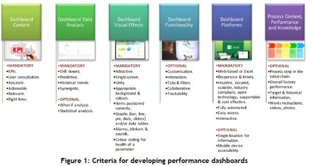
The existing problems with dashboards and the recommended design of dashboards were researched to determine the criteria for developing dashboards. The criteria are represented in Figure 1.
Conflicting views among authors and researchers [7], [14], [19], [27], [28], [29], [30], [31], [32], [33], [37] or insufficient information resulted in a number of criteria being inconclusive. When evaluating dashboards for further analysis, and as more research becomes available, it is important to take them into account:
• Type of platform used (Microsoft Excel or web-platform).
• Real-time or static data.
• Note whether a facilitator or consultant was used to develop the dashboard.
• Number of KPI metrics represented on the dashboard.
• Does the dashboard have executive sponsorship?
• Note whether the dashboard is accessible via a mobile device.
3 PROBLEM STATEMENT
Researchers [7], [13], [14], [15], [16] agree that information is key to successful strategic implementation. Dashboards improve strategic communication and coordination, business performance, and performance management. However, despite the availability of extensive research detailing the theoretical design of dashboards, organisations still experience challenges in developing and implementing performance dashboards. Research has yielded few case studies on the successful use of dashboards in manufacturing firms; nor are there critical reviews of existing performance dashboards in organisations to ascertain potential reasons for their failure - or rather, their further improvement. This study sought to understand the problems associated with the failure of performance dashboards in industry, and to determine the criteria for designing performance dashboards as a tool for achieving strategic goals.
4 OBJECTIVES OF THE RESEARCH
Consistent with the problem statement, the primary objective of this study was to explore the design of performance dashboards in relation to achieving organisational strategic goals. This included observing dashboards in an organisation in comparison with the theoretical criteria for designing a dashboard, focusing on the areas of dashboard content, analysis, visual effects, functionality, and platforms. To complement and add context to the primary objective, the secondary research objectives were: to evaluate the dashboard platform used in an organisation for insight into whether the platform could be Microsoft Excel or web-based; to assess the BI maturity, the generation of dashboards used, and the evolution of reporting in the organisation; and to assess the success of dashboards in a manufacturing firm.
5 RESEARCH METHODOLOGY
Exploratory research was deemed relevant for this study, as the subject was regarded as a new or under-researched topic. Primary data was required to achieve the research objective, as the literature review revealed that little research has been done to explore the design of performance dashboards that are implemented in industry. The primary data yielded real-life insight into the practical use of performance dashboards in industry, and also yielded behavioural insights.
A qualitative approach was appropriate for the research. Kothari [38] states that a qualitative approach to research is concerned with the subjective assessment of attitudes, opinions, and behaviour. For this research, in-depth interviews allowed the researcher to obtain the required data to meet the objectives of this study, and to gain deeper insight into the practical application of dashboards in an organisation. Non-probability sampling (purposive or deliberate selection) was used to select the participants, based on a set of criteria. The researcher addressed potential sample selection errors by using a set of criteria to select participants, and created an environment in which the participant would be comfortable in order to maintain realism, integrity, and objectivity and so prevent response bias. A manufacturing firm with many different departments was used as the source of the primary data. The facility is highly integrated and complex, implying that management and optimisation are challenging. The research conducted was consistent with ethical requirements and guidelines.
6 RESEARCH FINDINGS AND DISCUSSION
Eight participants employed by a manufacturing firm took part in in-depth interviews. The participants were diverse regarding their designation, roles, and responsibilities in the organisation, which resulted in a sample that was representative of the entire organisation. These interviews provided sufficient information to fill the research gap. The participants are described below:
• Participant 1: Senior manager responsible for business unit integration.
• Participant 2: Senior manager of the technical department.
• Participant 3: Area manager of an operations business unit.
• Participant 4: Team leader of a technical department.
• Participant 5: Technical specialist in energy efficiency.
• Participant 6: Senior manager of an operations business unit.
• Participant 7: Area manager of an operations business unit.
• Participant 8: Senior manager for planning, optimisation, and performance evaluation.
6.1 Dashboard content
The participants indicated that the dashboard content should consist of the KPIs of the business, which ties perfectly into the organisation's strategy. Dashboards must highlight areas of concern, and enable the user to make good decisions. Most participants stressed that data in the dashboard must be reliable and accurate.
"If information is inaccurate, you will lose your audience in a day and you will never regain them." (Participant 5)
Most of the participants prefer information in the form of day averages. Participant 5 explained that daily averages are sufficient, and provide the business unit with around 30 opportunities every month to evaluate their performance and to take action to correct the situation. Participant 1 stated that 30- and 90-day averages were identified as reasonable statistical figures that represent the stability of the business, and can be used as the baseline. Participant 8 added that dashboards should contain leading and lagging indicators, and participant 4 added that dashboards must contain the ranges and targets for parameters. The importance of translating information into aggregated values that can be related to the organisation's strategic activities was discussed by participants 5 and 8. In terms of 'relevant' information, participant 5 said that every number in a dashboard must have a relationship or baseline, and emphasised that, when deciding what parameters to include in a dashboard, one must ensure that they speak the same language as those who must act. Expanding further on dashboard content, participant 3 described a dashboard that included the monetary aspect of how much the business was losing due to non-optimal operation. Participants 1, 3, 6, and 8 reinforced the importance of collaboration and engagement between stakeholders. The process described by these participants indicates a positive alignment among stakeholders to create a business enablement tool.
6.2 Dashboard data analysis
Almost all of the participants indicated that dashboards should have drill down capabilities, mostly to understand the root cause of deviations. Participant 5 reported that, behind their overall dashboard, there is a fully automated and detailed report and different levels of information, all within one Microsoft Excel spreadsheet. Participants 5 and 6 mentioned that information in a dashboard must be consolidated and built in layers, as opposed to having many different tools running, while participants 2 and 8 prefer that dashboards be kept simple with limited drill down capability. The detailed tools or information should remain with the employees who are responsible for a more detailed level of monitoring. In summary, most of the participants required drill down capability. The nature of the drill downs may vary between business units, depending on their preferences and requirements.
Participants suggested that historical trends should be contained in a dashboard. However, they were more enthusiastic about dashboards having predictive capabilities. Participants 2 and 3 also said that statistical analysis in a dashboard is a must. According to Participant 3, dashboards must highlight issues and look forward to the medium and long term. Ideally, dashboards should have a fault-finding capability via statistical data analysis.
"Digitisation is here. Companies are looking for solutions to do more with less. Industries are starting to have less people in teams. If dashboards are predictive and give recommendations, it will be effective." (Participant 2)
Participants also said that fault trees should be integrated with dashboards, and that the dashboard should be used as a tool to capture the intelligence and experience of employees to enable sustainable business operations.
Participant 1 provided insight into the use of dashboards among stakeholders and the reaction experienced when stakeholders are presented with their deviations. Strong reactions and responses were experienced that stemmed from the dashboard displays. Having introduced pictures and arrows, stakeholders are now reacting to the dashboards and taking corrective actions. He described the synergies between various business units across the value chain to optimise performance. Whether good or bad, stakeholders cannot hide behind the information. If there were discrepancies between stakeholders, the team discussed and adapted the parameters and associated ranges. Participant 8 said that the information in a dashboard must create dynamics in the conversation.
6.3 Dashboard visual effects
There were clear common preferences for how information in dashboards should be represented. Participants agreed that dashboards at the highest level should be a single page or screen. They also agreed that simplicity is key. Participants implied that information in dashboards should be conditionally formatted using standard colours (red, amber, and green). They identified line graphs and tables as a preferred way of representing information. When deciding how to structure a dashboard, Participant 2 indicated that the font, colours, and layout must be standardised. From observation of the participants' dashboards, the number of parameters they contained varied from three to more than 20 parameters. The data was presented mainly in tables and simple graphs using robot colours to indicate the status. Participant 3 indicated that simplicity is very important: the moment it gets too intricate, you lose the main points "in the noise of things". Participant 8 added that dashboards must be easy to read, and the information must be clear.
"Simpler is best. You can make it extremely complex, nice looking and trendy in terms of graphics, but at the end of the day a simple graph with robot status incorporated and a baseline can give you a lot of information." (Participant 5)
Participant 3 urged that the dashboard not look like a SmartiesTM box. Standard measurement scales must be used, ensuring that the user can easily relate to them. Participant 1 uses 'up' and 'down' arrows and clocks in their dashboard. With this initiative, they observed that stakeholders became upset when they were in the red, and they therefore reacted to correct the trend. Participants also highlighted visuals that they dislike in dashboards. Participant 2 said that visual effects such as blinkers, flashers, and alarms can be "irritating". It must also not be difficult for the user to determine what diagrams mean, and the legends must be clear and accurate.
6.4 Dashboard platforms
The dashboards of the participants were developed in either Microsoft Excel or SharePoint, a web-based platform. Participants stated that they do not have a preference between platforms if the functionality serves their requirements, is user-friendly, is accurate, and can analyse data. Participant 3 stated that web-based dashboards and accessibility via mobile phones were "the way of the future". Web-based platforms have the advantage of accessibility from remote locations and better drill-down functionality. Participants did not raise any concerns about the security of web-based platforms, and would be willing to pay for platforms that would enhance their business performance. Participant 3 said that Microsoft Excel is an incredible tool, and it will always have a function - but it has limitations. Participant 5 stated, however, that in his very complex environment, one would never be able to replicate Microsoft Excel in a web-based environment. Microsoft Excel is more difficult to share, so it must be packaged such that everyone can access it - e.g., by using SharePoint links. This participant did indicate, however, that in a less complex environment one can use a web-based program. Five participants supported the option of having a dashboard platform that is compatible with mobile devices; however, three participants did not feel the need for this from a work/life balance perspective, and were concerned about the potential to create a disempowered workforce. Participant 8 implied that, if this feature were implemented, it would have to be managed correctly.
6.5 Dashboard functionality
"The moment users start customising, you do not talk the same language, and one always has to interpret and decode the messages being relayed. It needs to be the same for everyone." (Participant 2)
Participant 8 suggested that we need to standardise to make the system look neater with respect to both the visual effects and the indicators used for performance and economics. Participants 1, 3, and 4 indicated that some degree of customisation should be allowed, as different users have different needs. The user must have some flexibility to emphasise the information on specific problems; however, the format must remain standard.
The researcher observed that an online user interaction functionality was not necessarily a priority for the participants at this stage. Three participants were adamant that dashboards are a visual representation and should not be used for anything else. Participant 5 said that, as opposed to online user interaction, he recommended reverting to traditional communication methods such as a phone call or a personal message to ensure that a stakeholder takes the required action. Participants 2, 3, and 4 stated that online user interaction can be positive. Discussing via an online platform might eliminate some meetings. Participant 3 described the integration of dashboards into workflow management systems. This potential future advancement would require a significant upskilling of employees.
Overall, only a few participants responded about process context, performance, and knowledge; thus the researcher deduced that such functionality was not a high priority.
6.6 Dashboard benefits
Participants were unanimous that there are benefits to using dashboards in business, and that they are undoubtedly a business enablement tool that is required to achieve strategic goals. Five of the eight participants could quantify the benefits in production volumes, cost and loss reduction, and adherence to plan.
"Last year we had record production in history, and that type of performance does not happen without tools such as dashboards." (Participant 5)
6.7 Business intelligence maturity
Participants were requested to comment on which stage of the BI maturity model they believed their business unit was currently in. The participants' responses are presented in Table 1. Most of the business units were clustered between the 'infant' and 'teenager' stages, with the business unit of Participant 5 being highly advanced in the 'adult' to 'sage' stages. All participants indicated that they were in the process of progressing to the next stages. The organisation had already implemented scorecards, and had an established planning and scheduling process that ensured that the overall business performance was optimal.
6.8 Business culture for dashboards
Participant 1 indicated that it took time to convert information into dashboards, and needed about six months to alter stakeholders' behaviour. The fact that stakeholders were exposed helped to drive the correct behaviour. Accountability was also assigned to various stakeholders to assist with the change in behaviour. He added that dashboards should not come from the top down; people do not all react the same to this approach, and there must be buy-in. To build on this, participant 2 said that dashboards must be visible to the entire team.
Participant 8 mentioned that dashboards can fall apart if they are manual and cumbersome, as they are then prone to errors and misinterpretation. The administration of dashboards must be simple. He added that defining the business process, together with verifying and auditing the dashboards, is very important. In the business unit of participant 6, employees had to learn to believe in automation, and so were sent on courses to improve their skills.
According to participant 6, the use of dashboards was picking up throughout the business, even though there was no executive sponsorship. Managers were starting to develop dashboards, based on the need to enhance their business performance.
6.9 Dashboard maintenance
Participant 1 indicated that they still faced a challenge in transferring some manual data automatically into a dashboard. He added that some aspects of a dashboard would always be manual, and that stakeholders must be able to offer support in this regard.
Participant 3 stated that dashboards are living tools that must be adapted and updated as required. Participant 3 stated that some of the reasons that dashboards fail are poor revision control, management of change, and maintenance. He added that dashboards require IT maintenance and technical maintenance, which must be taken account of when developing dashboards.
7 CONCLUSIONS AND RECOMMENDATIONS
The study revealed that managers are becoming increasingly dependent on dashboards; however, not all organisations are able to develop them successfully. The tangible benefits of dashboards are evident, even when businesses are in the early stages of BI.
Unfortunately, there is no generic template for dashboards, as the development of successful dashboards can be a detailed and complex task. The literature review yielded best-practice guidelines for developing performance dashboards. The identified research gap was that there are minimal case studies on the successful use of dashboards in manufacturing firms that would help to determine the criteria for designing dashboards as a tool to achieve organisational strategic goals. This research focused on operational dashboards to ensure the communication of strategic goals on every organisational level. The research gap was closed by acquiring theoretical design criteria for dashboards, and integrating the criteria with best practices based on research conducted within a manufacturing firm.
The primary objective of the study was to explore the design of performance dashboards in relation to achieving organisational strategic goals, and to observe dashboards in an organisation in comparison with theoretical criteria for designing dashboards. The theoretical criteria for dashboard design focused on the areas of dashboard content, analysis, visual effects, functionality, and platforms. The secondary research objectives were to determine whether the dashboard platform could be Microsoft Excel or web-based; to assess the BI maturity, generation of dashboards and evolution of reporting in the organisation; and to assess the success of dashboards in an integrated and complex manufacturing firm.
Although many business units in the organisation still have dashboards in Microsoft Excel, they are evolving towards web-based programs. Platforms must be user-friendly and accurate; must ensure improved governance; must have historical, predictive, and statistical analysis capabilities; and must enable standardisation in the organisation. The research revealed that Microsoft Excel will always have a role, mostly as a tool that feeds into web-based dashboards. Additionally, in a highly complex environment, Microsoft Excel may be the most appropriate dashboard tool to prevent translation issues between Microsoft Excel and web-based platforms. The ability to access dashboards via mobile devices should be available; however, it must be managed correctly so as not to impact the work/life balance or disempower subordinates.
Using the BI maturity model [18] as a tool to assess the maturity of the organisation, most business units were found to be between the 'infant' and 'teenager' stages. The organisation mostly uses simple monitoring tools, with some having progressed to using drill-down functionality. The organisation uses scorecards to communicate the strategy and dashboards to improve business performance on a more frequent basis.
The organisation has reaped the benefits of dashboards, which can be substantially quantified via energy efficiency, cost reduction, loss reduction, adherence to plans, and logistic cost savings. Dashboards were mentioned as a contributing factor to the record production achieved by the organisation in the previous financial year. The visibility of performance that is achieved by dashboards has improved efficiency in the organisation and in the way that concerns are managed before they escalate into a bigger problem.
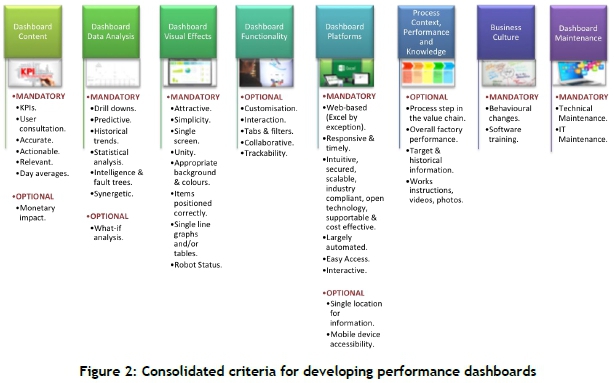
The theoretical criteria for dashboard design focused on the areas of dashboard content, analysis, visual effects, functionality, and platforms. During the research, the additional criteria that emerged were:
• Monetary impact of poor performance
• Dashboard intelligence and fault trees
• Business culture for dashboards
• Dashboard maintenance
Dashboard content should be the key parameter and source of information that ties into the KPIs of the business unit and the organisation's strategy. Enhancing the dashboard by including the monetary losses associated with poor performance can be powerful, as users understand its impact and the urgent need to fix it. Information in dashboards must be accurate and reliable, and relevant; and this is achieved by ensuring that baselines and relationships are incorporated into the dashboard. The research results indicated that information in the form of day averages is adequate. When developing dashboards, collaboration with stakeholders is important. While the drive for dashboards can be from the top management downwards, the development of dashboards must occur in a bottom-up approach to ensure that all stakeholders agree on the detail, including the parameters to monitor, the definitions, and the ranges.
Dashboards must have drill-down capabilities, the extent of which must be agreed among the stakeholders when developing the dashboards. All drill-down layers must cascade up to the main page of the dashboard in one tool. Dashboards must have the ability to provide historical trends. A built-in predictive capability is crucial to allow the user to be proactive. To support predictability, statistical analysis capability is important. Fault trees and expert knowledge should be captured in dashboards so that they can provide preliminary diagnostics for problem areas. Dashboards must also create synergy between stakeholders so that they are empowered to optimise performance with the information that is presented.
Dashboards must be well-presented to receive the right attention. The dashboard must be a single page or screen. Simplicity and standardisation are important. The standard robot status - using red, amber, and green colours to represent the status of parameters - is ideal, along with globally understood measurement scales. Simple graphs with individual trends and tables are a preferred way of representing information. While the literature suggests the use of blinkers, flashers, and alarms, these were not seen during the research, and were mostly discouraged.
The study addressed the use of Microsoft Excel versus web-based platforms, as well as the accessibility of dashboards from mobile devices, as a secondary objective. To build on this, organisations are willing to pay for platforms that can serve their requirements. Ideally, users want dashboards to be fully automated; however, in complex and integrated organisations, users accept that in some circumstances information must be captured manually; and they can manage this accordingly. Organisations that are in the early stages of BI can develop their dashboards in Microsoft Excel, which can serve as a trial for establishing their requirements to develop successful dashboards.
Dashboards should be standard, and user customisation should be limited. Interaction with stakeholders or employees should be by means of traditional communication methods such as phone calls or personal messages. While online user interaction might have some benefits, it is more futuristic, and is not necessarily a priority at present. Similarly, the incorporation of process context, performance, and knowledge information in a dashboard is not mandatory at present.
The development of successful dashboards can be time-consuming, especially when behavioural adaptations are required. Exposure and assigning accountability helps to drive the correct behaviour. Behavioural changes may include upskilling and software training. Dashboards do not necessarily require executive sponsorship. Dashboards can emerge when management identifies the need to improve business performance and thus to introduce dashboards into their business.
Where manual inputs are required, stakeholders need to ensure that this is well-managed. Dashboards are living tools that must be adapted and updated as required. Revision control, management of change, and maintenance of dashboards must be included in the business process. Dashboards will require technical and IT maintenance, for which resources must be considered.
The theoretical criteria were consolidated with best practice guidelines to establish a tool that organisations can use to implement and review their dashboards. Figure 2 provides a diagrammatic representation of the guidelines.
Dashboards form part of a business process. Their development and implementation can be a detailed and complex task, and should not be undertaken in haste. The business process involves developing an understanding of the process and operating relationships, together with the creation of fault trees and decision trees. While dashboards can be driven from the top down, development must be from the bottom-up. Also, senior managers and area managers can initiate the use of dashboards without executive sponsorship.
While the research gap was closed, there is research on the practical application of dashboards in industry. Future research is recommended in other manufacturing firms, in organisations of advanced BI maturity, and in organisations of a more creative typology.
This research provides a consolidated set of mandatory and optional design criteria for operational dashboards that organisations can use when implementing or reviewing their dashboards. The approach is structured and simplified, providing a business with adequate background for implementing dashboards as a business enablement tool to achieve strategic goals.
7.1 Managerial implications and recommendations
To ensure the success of dashboards, a structured development process is required with adequate stakeholder involvement. This research assignment has provided mandatory dashboard criteria, categorised as dashboard content, analysis, visual effects, platforms, business culture, and maintenance. A premature roll-out of dashboards created in silos can generate turbulence in the business unit. The study recommends that dashboard development start with first-generation dashboards and Microsoft Excel spreadsheets rather than skipping stages, as this would help stakeholders to understand their requirements better. Managers must identify where upskilling and training of personnel is required to ensure that dashboards are reliable and accurate.
7.2 Limitations, and future research
The research was conducted within a single organisation, and so the results might be specific to this organisation. It is uncertain whether the concepts will apply similarly to other industries. Thus future research in other manufacturing organisations is recommended. The research was conducted within an organisation that is in the early to middle stages of BI maturity. Research in an organisation that is more advanced might provide deeper experiential learning advice. The manufacturing organisation selected comprises mostly scientific and technical employees. Future research in a more creative environment might yield different results. This research methodology could be replicated in future research in different organisations and industries. The detailed role of data mining, data warehousing, and big data and analytics was outside of the scope of this research, and could be incorporated into future research.
7.3 Reconciliation of research objectives
The research gap that the study identified was that there are minimal case studies on the successful use of dashboards, especially in manufacturing firms, to determine the criteria for designing dashboards as a tool to achieve organisational strategic goals. Information derived from theoretical sources was consolidated with research findings achieved via in-depth interviews to create a list of mandatory and optional criteria for the design of performance dashboards. There were common findings between participants that enabled conclusions to be reached on many of the design criteria for dashboards. Where there were differences among the responses, these were mainly because those criteria are dependent on the needs of the specific business unit. The research gap was closed by establishing the criteria for the design of the performance dashboards, indicated in Figure 2, that organisations can use to develop successful dashboards.
REFERENCES
[1] Hrebiniak, L. G. 2006. Obstacles to effective strategy implementation. Organizational Dynamics, 35(1), 12-31. [ Links ]
[2] MacLennan, A. 2011. Strategy execution: Translating strategy into action in complex organisations. Oxford: Routledge. [ Links ]
[3] Kaplan, R. S., & Norton, D. P. 2008a. The execution premium: Linking strategy to operations for competitive advantage. Boston, MA: Harvard Business Press. [ Links ]
[4] Ungerer, M., Ungerer, G., & Herholdt, J. 2016. Navigating strategic possibilities. Randburg: KR Publishing. [ Links ]
[5] Shah, A. 2005. The foundations of successful strategy implementation: Overcoming the obstacles. Global Business Review, 6(2), 293-302. [ Links ]
[6] Kaplan, R. S., & Norton, D. P. 2008b. Mastering the management system. Harvard Business Review, 86(1), 1-16. [ Links ]
[7] Eckerson, W. W. 2011. Performance dashboards: Measuring, monitoring, and managing your business (2nd ed.). Hoboken, NJ: John Wiley & Sons. [ Links ]
[8] Lederer, A. L., & Nath, R. 1990. Making strategic information systems happen. Academy of Management Perspectives, 4(3), 76-83. [ Links ]
[9] Yeoh, W., Richards, G., & Wang, S. 2014. Benefits and barriers to corporate performance managementstems. The Journal of Computer Information Systems, 55(1), 105-111. [ Links ]
[10] Rouse, M. 2014. Organisational goals. Retrieved from http://searchcio.techtarget.com/definition/organizational-goals. [ Links ]
[11] Neilson, G. L., Martin, K. L., & Powers, E. 2008. The secrets to successful strategy execution. Harvard Business Review, 86(6), 1-14. [ Links ]
[12] Scheps, S. 2008. Business intelligence for dummies. Hoboken, NJ: Wiley Publishing. [ Links ]
[13] Hrebiniak, L. G. 2013. Making strategy work: Leading effective execution and change (2nd ed.). Hoboken, NJ: Pearson Education. [ Links ]
[14] Rasmussen, N. 2009. Business dashboards. Hoboken, NJ: John Wiley & Sons. [ Links ]
[15] Davenport, T. H. 1993. Process innovation reengineering work through information technology. Boston: Harvard Business School Press. [ Links ]
[16] Kaplan, R. S., & Norton, D. P. 1996. The balanced scorecard. Boston, MA: Harvard Business School Press. [ Links ]
[17] Herschel, R. 2012. Organisational applications of business intelligence management: Emerging trends. Philadelphia, PA: Saint Joseph's University. [ Links ]
[18] Eckerson, W. W. 2007. Beyond the basics: Accelerating BI maturity. Retrieved from http://download.101com.com/pub/tdwi/Files/SAP_monograph_0407.pdf. [ Links ]
[19] Malik, S. 2005. Enterprise dashboards design and best practices for IT. Hoboken, NJ: John Wiley & Sons. [ Links ]
[20] Alexander, J. 2007. Performance dashboards and analysis for value creation. Hoboken, NJ: John Wiley & Sons. [ Links ]
[21] Eckerson, W. W. 2009. Performance management strategies: How to create and deploy effective metrics. Retrieved from https://www.microstrategy.com/Strategy/media/downloads/white-papers/TDWI_Performance-Management-Strategies.pdf. [ Links ]
[22] Lawson, R., Stratton, W., & Hatch, T. 2007. Scorecards and dashboards: Partners in performance. Retrieved from http://www.bragstudies.com/articles/ScorecardsandDashboards-PartnersinPerformance.pdf. [ Links ]
[23] Few, S. 2007a. Data visualisation: Past, present, and future. Retrieved from ftp://public.dhe.ibm.com/software/data/sw-library/cognos/pdfs/whitepapers/wp_data_visualization_past_present_future.pdf. [ Links ]
[24] Baker, J. D. 2015. Language of improvement: Metrics, key performance indicators, analytics, scorecards, and dashboards. AORN Journal, 102(3), 223-227. [ Links ]
[25] Gallagher, K., Goh, S., & Zhang, X. 2011. BI application: Dashboards for healthcare. In AIS/ICIS Administrative Office (ed.), AMCIS 2011 Proceedings, pp. 3898-3902. Red Hook, NY: Curran Associates. [ Links ]
[26] Rufai, S., Cronbach, P., Alexander, P., & Lash, S. 2015. A management dashboard to boost operating theatre utilisation, productivity and profitability. International Journal of Surgery, 20, 26-27. [ Links ]
[27] Syrett, M. 2007. Successful strategy execution: How to keep your business goals on target. London: Profile Books. [ Links ]
[28] Person, R. 2013. Balanced scorecards and operational dashboards with Microsoft Excel (2nd ed.). Indianapolis, IN: John Wiley & Sons. [ Links ]
[29] Stiffler, M. A. 2006. Performance: Creating the performance-driven organization. Hoboken, NJ: John Wiley & Sons. [ Links ]
[30] Bremser, W. G., & Wagner, W. P. 2013. Developing dashboards for performance management. The CPA Journal, 83(7), 62-67. [ Links ]
[31] Groger, C., Hillmann, M., Hahn, F., Mitschang, B., & Westkamper, E. 2013. The operational process dashboard for manufacturing. Procedia CIRP, 7, 205-210. [ Links ]
[32] Cokins, G. 2009. Performance management: Integrating strategy excution, methodologies, risk, and analytics. Hoboken, NJ: John Wiley & Sons. [ Links ]
[33] Few, S. 2007b. Dashboard confusion revisited. Retrieved from https://www.perceptualedge.com/articles/03-22-07.pdf. [ Links ]
[34] Few, S. 2006. Information dashboard design: The effective visual communication of data. Sebastopol, CA: O' Reilly Media. [ Links ]
[35] Butler, L. M. 2007. Warning lights: New dashboard reports help institutions gauge their performance. Boston, MA: New England Board of Higher Education. [ Links ]
[36] Bititci, U. C. 2015. Managing business performance: The science and the art. Chichester John Wiley & Sons. [ Links ]
[37] Pappas, L., & Whitman, L. 2011. Riding the technology wave: Effective dashboard data visualisation. Heidelberg: Springer. [ Links ]
[38] Kothari, C. 2004. Research methodology: Methods and techniques. New Delhi: New Age International. [ Links ]
Submitted by authors 22 Jul 2018
Accepted for publication 3 Jul 2019
Available online 30 Aug 2019
* Corresponding author: keshika.bugwandeen@outlook.com

