


Services on Demand
Article
 English (pdf)
 Article in xml format
 Article references
Indicators

Related links
-
 Cited by Google
 -
 Similars in Google
Share

 Permalink
South African Journal of Industrial Engineering
On-line version ISSN 2224-7890
Print version ISSN 1012-277X
S. Afr. J. Ind. Eng. vol.26 n.2 Pretoria Aug. 2015
CASE STUDIES
A comparison of Phase I control charts
M.L.I CoelhoI; S. ChakrabortiII, III; M.A. GrahamIV
IDepartment of Statistics University of Pretoria, South Africa. margicoelho@gmail.com
IIDepartment of Statistics University of Pretoria, South Africa
IIIDepartment of Information Systems, Statistics and Management Science University of Alabama, U.S.A. schakrab@cba.ua.edu
IVDepartment of Statistics University of Pretoria, South Africa. marien.graham@up.ac.za
ABSTRACT
A carefully done Phase I analysis is a vital part of an overall statistical process control and monitoring regime. Distribution-free control charts can play a useful role in this analysis, as a parametric model assumption often cannot be adequately verified. The performance of two distribution-free charts for the location - the mean-rank and the median chart - are compared in this paper. For benchmarking reasons, the parametric X-chart is included in the comparisons. It is seen that the distribution-free charts are in-control robust, whereas the X-chart is not, and they both perform similarly to the X-chart for normally distributed data. However, for non-normal data, they both outperform the X-chart. The results provide evidence in favour of using distribution-free Phase I charts in practice. Concluding remarks and suggestions for future research are given.
OPSOMMING
'n Versigtige analise van Fase I is 'n belangrike deel van 'n algehele statistiese proseskontrole en monitering skema. Verdelingsvrye kontrolekaarte kan 'n nuttige rol in hierdie fase speel, aangesien die model aannames nie voldoende geverifieer kan word nie. Die prestasie van twee verdelingsvrye kontrolekaarte - die gemiddelde-rank en die mediaan kontrolekaarte - word vergelyk in hierdie artikel. Vir vergelykingsredes, is die parametriese X-kontrolekaart ingeluit in die vergelykings. Dit is gevind dat die verdelingsvrye kontrolekaarte robuuste eienskappe het, terwyl die X-kontrolekaart dit nie het nie, en beide presteer op soortgelyke wyse as die X-kontrolekaart vir normaalverdeelde data. Egter, vir nie-normale data vaar albei beter as die X-kontrolekaart. Hierdie resultate bied bewyse ten gunste van die gebruik van verdelingsvrye Fase I kontrolekaarte in die praktyk. Slotopmerkings en voorstelle vir toekomstige navorsing word gegee.
1 INTRODUCTION
In Statistical Process Control (SPC) there are generally two phases or stages (see, for example, [1]). The initial phase is called Phase I, in which a retrospective analysis is performed on existing (historical) data in order to establish that a process is stable, i.e., in-control (IC), and thus to find an IC (or a reference) sample. This is an extremely important stage of process control. When process parameters are unknown or unspecified, a Phase I analysis must be done before process monitoring can begin, prospectively, in Phase II. Thus, most Phase II control charts assume that a reference sample is available from a corresponding Phase I analysis, from which the control limits can be estimated. Thus the success of prospective process monitoring in Phase II depends critically on the success of the Phase I analysis.
According to Montgomery [1], Shewhart-type control charts are particularly useful for Phase I analysis because they are easy to construct and interpret and they are effective in detecting large, sustained shifts in the process parameters and outliers, measurement errors, data recording, and/or transmission errors and the like, which are perhaps expected in the early part of a process development. For a thorough account of the Phase I control charting literature, see Chakraborti et al. [2]. Recognising and highlighting the importance of Phase I analysis, a more recent comprehensive account of it is given in Jones-Farmer et al. [3]. This reinforces the need for an effective Phase I analysis using appropriate methods and metrics. Many of the available control charts in the literature are parametric control charts, based on an assumption of a particular underlying process distribution, such as the normal. The performance of these charts generally deteriorates when the underlying assumptions are not met. In fact, it is well-known that the Shewhart charts are very sensitive to the normality assumption, in that their false alarm rates are inflated, often significantly, when the underlying distribution deviates from normality. Moreover, it is often not possible to know much about the underlying distribution in the early stages of process development and study (i.e., Phase I), so that a specific distributional assumption (such as normality) cannot be reasonably justified; see for example Woodall [4]. In these settings, nonparametric control charts can provide a useful and robust alternative to the practitioner. Two major advantages of the nonparametric charts are that one does not have to make an assumption about the form and the shape of the underlying process distribution, and that the IC properties of nonparametric (or distribution-free) charts (such as the false alarm probability (FAP)) remain known and constant (stable) over all continuous distributions. This makes the nonparametric charts particularly suitable for Phase I applications, since if the IC properties of a chart are not stable and robust - its further applications in Phase II become somewhat meaningless. For a list of advantages and a thorough account of the fast-growing nonparametric control charts literature, see Chakraborti et al. [5].
Although a lot of work has been done in nonparametric SPC over the last few years, much of this has been for prospective or Phase II process monitoring, which assumes the availability of an IC reference sample from a Phase I analysis. Although some work has been done in monitoring scale using Phase I charts (see, for example, Jones-Farmer and Champ [6]), in this paper our focus is on the Phase I analysis and monitoring of location parameters so as to find the reference sample. As we noted earlier, the success of an overall SPC monitoring and control regime depends on a successful Phase I analysis, and nonparametric control charts can be especially useful in this setting. In this paper, we compare the performance of two of the available nonparametric Shewhart-type Phase I control charts according to their IC and out-of-control (OOC) performance based on the FAP, which is the probability of at least one false alarm out of m Phase I samples (where a false alarm is the event that a single charting statistic plots on or outside the control limits when the process is IC). Note that the FAP is the metric usually used in Phase I, as the signalling events are dependent.
Of the two nonparametric charts included in our study, the first chart is the mean-rank chart, which is based on the standardised subgroup mean-rank, as proposed by Jones-Farmer et al. [7]. This chart is distribution-free and, consequently, it maintains a constant and known FAP for all continuous distributions. The second nonparametric chart in our study is the one proposed by Graham et al. [8], which is based on the subgroup precedence counts from the pooled median. This chart is also distribution-free and thus maintains a stable and known IC performance for all continuous distributions. Both of these distribution-free charts are effective at detecting shifts in the location of the process and useful to establish control in Phase I. We emphasise that, to date, a head-to-head performance comparison of the mean-rank and median charts is not available; we intend, therefore, to fill that gap in this study. This is important information, since practitioners need to know which of these nonparametric charts should be used, and when. However, although the focus is on nonparametric charts, we include a normal theory (parametric) chart in our study for benchmarking purposes. This is the Phase I  -chart for the mean, proposed by Champ and Jones [9], which is based on the assumption of normality. When the underlying process is indeed normally distributed, this chart is expected to achieve an FAP very close to or equal to the nominal FAP0, and should be more effective in detecting shifts in the process mean with a higher signalling probability. However, when the process distribution deviates from the normal distribution, its efficacy becomes questionable. This is typical of parametric charts; and this is why their IC robustness is always a practical concern.
We study the performance of all three charts in a simulation study for different combinations of subgroup size m and sample size n. First, we introduce the Phase I control charts, starting with the two nonparametric charts.
2 PHASE I CONTROL CHARTS
2.1 Phase I mean-rank chart
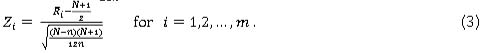
A nonparametric Phase I Shewhart-type control chart was proposed by Jones-Farmer et al. [7]. This chart is based on the well-known Kruskal-Wallis test (see Gibbons and Chakraborti [10]). We begin by combining the observations from the m Phase I samples in a single pooled sample of size Ν = m χ η and ordering the observations from the lowest to the highest. Then ranks (Rtjwhere i = 1,2,...,m and = 1,2,...,n) are assigned to each observation of this pooled sample. The average rank for the ;th sample is given by

The charting statistics for the mean-rank chart are the standardised sample mean-ranks, given by

Since the expected value and the variance of the ranks, when the process is IC, are given by  and
and  (see Gibbons and Chakraborti [10], page 192), the expected value and the variance of
  for an IC process are given by
  and
and  , respectively. Thus, Zt in Equation (2) simplifies to
Jones-Farmer et al. [7] studied two choices of the control limits: the simulated and the approximate normal theory control limits. For the latter choice, note that by the central limit theorem for large n, the standardised mean rank Z; approximately follows a standard normal distribution when the process is IC. However, the charting statistics Z1, Z2,.... Zm are dependent random variables, and this dependence needs to be properly accounted for. Appealing to available results in the literature, Jones-Farmer et al. [7] claimed that, asymptotically, the joint distribution of Z1,Z2Zm can be approximated by a multivariate normal distribution with means equal to zero, standard deviations equal to one, and a common pairwise correlation  . Since this correlation tends to zero as m increases (for equal subgroup sizes), the authors suggested that the lower control limit (LCL) and the upper control limit (UCL) can be approximated using the quantiles of the (univariate) standard normal distribution. The control limits are chosen such that the attained FAP does not exceed a given FAP0 = a. Using Monte Carlo simulations, the authors provided tables for the control limits using the normal approximation for a = 0.05 or 0.10. The centre line of the proposed chart, CL, is equal to zero. It was recommended that the simulated limits, and not the approximate normal theory tables, be used, since the latter were more conservative (see Jones-Farmer et al. [7]). In short, these control limits are based on the simulated empirical distribution of the standardised mean rank, Z;, and vary based on the combination of m and n. Although exact limits are possible to be obtained by enumerating the distribution of the standardised mean rank, doing so is impractical for moderate values of m. Accordingly, the authors provided control limits, for specific (m, n) combinations using 100,000 Monte Carlo simulations. They recommended that a conservative approach be used so that the attained FAP does not exceed a given FAP0 = a; i.e., the control limits are found using Monte Carlo simulations so that FAP < a. Using simulations, we extended the tables of the control limits in Jones-Farmer et al. [7] by considering some of their combinations of m and η and incorporating other combinations of m and n. This should be of benefit in practice.
We describe the second nonparametric Phase I control chart next.
2.2 Phase I median chart
An alternative to the mean-rank chart, proposed by Graham et al. [8], is called the median chart. This chart is based on the well-known Mood test (see Gibbons and Chakraborti [10], page 323). Suppose that Μ denotes the median of the pooled sample of size N. The charting statistic for the median chart is the subgroup precedence statistic - i.e., the number of observations that precede Μ - and is given by 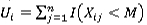 for i = 1,2,...,m, where Μ denotes the pooled median and I(A) = 1 or 0 when A is true or false.
As in the case of the mean-rank statistics, the charting statistics U1, U2,..., Um are dependent, and so the IC joint distribution of U1,U2,....Um is necessary in order to calculate the FAP and the charting constant a. For a more detailed derivation of the IC joint distribution and of the FAP, refer to Graham et al. [8]. Since the IC distribution is symmetrical about its mean, the authors propose using symmetrically placed control limits with LCL = a, UCL = η-a and CL = 0.
Since the joint distribution of the Ui´s is discrete, a conservative approach is used where a is found as the largest positive integer, such that the attained FAP is less than or equal a specified FAP0. It can be shown that
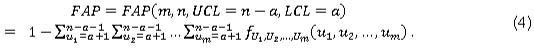
Thus a is the largest positive integer, so that

Graham et al. [8] found that some of the attained FAP values can be very conservative, meaning that they may be much smaller than the FAP0 value. They provided tables for the control limits for several combinations of subgroup size m of size n, for FAP0 values 0.01, 0.05, and 0.10 respectively. They noted that the sample size η needs to be much larger than the number of Phase I sample m in order to achieve industry-standard small FAP values.
Graham et al. [8] also showed that the correlation between any two charting statistics, when the process is IC, is -1/(m - 1), which tends to zero as m increases. Consequently, we can approximate the control limits by ignoring the dependence among the charting statistics, simply using the marginal univariate hypergeometric distribution of the Ui's.
Although our main purpose is to compare the two nonparametric Phase I charts head to head, for benchmarking and robustness considerations, we also include the normal theory Phase I  -chart proposed by Champ and Jones [9]. This is briefly described in the next section.
2.3 Phase I  chart
chart
A Phase I  -chart was proposed by Champ and Jones [9], which assumed that the underlying distribution is normal. The charting statistic for this chart is the mean, X, of each Phase I sample, and the control limits are given by
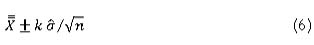
where X is the grand mean; i.e.,  ; and Xtj denotes the jTh observation from the 7th subgroup. The unbiased estimator of the process standard deviation σ is based on the average sample variances, and is given by
  , where c4 is an unbiasing constant and Si2 is the ith sample variance. The constant k > 0 is the chart design constant.
Champ and Jones [9] provided tables for the charting constant k for several combinations of m and n. They also studied the choice of the control limits for m > 20, using simulations, with (i) exact limits based on the multivariate t distribution, (ii) approximate limits using the univariate Student's t critical values, and (iii) approximate limits assuming that Tvi approximately follows a standard normal distribution (this is only recommended where m > 30). The reader is referred to their paper for more details. Briefly speaking, the charting constant k (i.e., the control limit) is found using 100,000 Monte Carlo simulations for a specific (m, n) combination so that the attained FAP does not exceed the given FAP0 = a.The authors recommended that when m < 20 subgroups are available, the constants given for the multivariate t distribution are to be used to compute the limits. However, for m > 20, the authors suggested that the constants be obtained using the (univariate) t distribution with m(n - 1) degrees of freedom.
3 COMPARATIVE STUDY
3.1 Implementation of the control charts
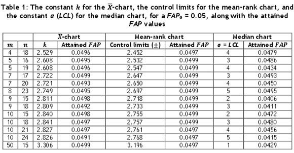
In order to compare the performance of the control charts, first the control limits need to be found; we discuss this here. To this end, note that the discreteness of the two nonparametric charting statistics causes the attained FAP values to be sometimes very conservative and often much smaller than a nominal value - say, 0.05. Thus we chose combinations of m and η values that yielded attained FAP values closest to the nominal value of 0.05. This is also one of the reasons why larger values of η were used, which is not the typical approach when implementing variables control charts. However, note that this (larger η > m) is often necessary for the case of attributes control charts where the charting statistics have discrete distributions, as in the case of the nonparametric charts. Since exact calculations are tedious and involve multidimensional sums and integrals, simulation was used. In Table 1, the control limits for the two nonparametric charts are provided, along with the constant k for the  -chart and the attained FAP values, for a FAP0 = 0.05 and a number of combinations of m and η values. When investigating which combinations of m and η to consider, recall that for the median chart, the sample size η needs to be much larger than the number of Phase I sample m in order to achieve industry-standard small FAP values. Accordingly, we considered smaller values of m (= 4, 5, 6, 7, 8, 9, and 10) paired with larger values of η (=15(1)25), obtained the corresponding FAP values, and selected the pairs that yielded the attained FAP values closest to the nominal value of 0.05. We included one larger value of m (=50), together with the value of η (=15), which yielded an attained FAP value closest to the nominal value of 0.05. Table 1 will be useful to implement the Phase I control charts under consideration in practice.
3.2 Performance comparisons
A comparison of the chart performance was done by means of extensive Monte Carlo simulations using 50,000 iterations in SAS® v 9.3. For each iteration, m samples, each of size n, were generated from one of three distributions: the standard normal distribution (N(0,1)), the symmetric but heavier-tailed Student's t distribution with three degrees of freedom (t(3)), and the right-skewed Gamma distribution with a shape parameter of two and a scale parameter of one (Gamma(2,1)). We compare both the IC and the OOC performance of the Phase I control charts. The IC performance indicates how robust the chart is with respect to the specified FAP0 value; the nonparametric charts are expected to be IC robust (because they are distribution-free), but since the charting statistics are discrete, it is of interest to see what the attained FAP values are and how far off they might be from the nominal values. On the other hand, the OOC comparison involves comparing the probabilities of alarm (at least one signal) under some 'OOC condition' when the charts have the same or roughly the same FAP0 (i.e. the same IC performance). The chart with the highest probability of at least one signal under the OOC condition is favoured.
3.2.1 IC performance
The control limits for the two nonparametric charts were found from Table 1. For the  -chart, the control limits were set up using the constant k from Table 1. Then, using simulations, the attained FAP values were found and compared with the FAP0of 0.05. Figures 1(a) to 1(c) show the IC performance of the three charts for the N(0,1), t(3), and Gamma(2,1) distribution respectively. Since the
  -chart assumes normality, it is expected that this chart will perform well in the case of N(0,1) distribution. From Figure 1(a) it can be seen that that is the case. However, the mean-rank chart also has attained FAP values very near the nominal level of 0.05. The median chart also performs well; but its attained FAP values are more conservative. Thus, in the IC case, all three charts seem to perform well in the case of the normal distribution, performing at or close to the FAP0 values.
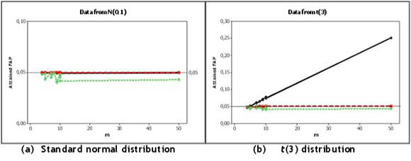
When the underlying distribution is symmetric but more heavy-tailed, such as the t(3) distribution, as shown in Figure 1(b), the mean-rank chart still provides attained FAP values very close to the FAP0. The median chart also performs well, but its attained FAP values are again seen to be conservative. The  -chart, however, performs very poorly, with attained FAP values larger than the nominal level and in fact increasing as m increases; for m = 50 it even reaches values larger than 0.25, which is unacceptable.
Finally, when the underlying distribution is skewed, such as the Gamma(2,1) distribution, the  -chart performs very poorly, with attained FAP values larger than the nominal level. In addition, the attained FAP values increase as m increases, as in the case of the t(3) distribution; for m = 50 it reaches values just under 0.10. This is shown in Figure 1(c). However, the mean-rank chart is seen to provide attained FAP values very close to the nominal value. The median chart also performs well, but the attained FAP values are again shown to be conservative.
In summary: from Figures 1(a) to 1(c) it is seen that the mean-rank chart has the best overall IC performance; however, the median chart is competitive, and performs well although somewhat conservatively (in terms of the attained FAP values). Although the  -chart performs well when the data follows a standard normal distribution, it performs quite poorly in the non-normal cases - i.e., for the t(3) and the Gamma(2,1) distributions. Thus the lack of IC robustness of the Phase I
  -chart should be a serious concern for its implementation in practice.
3.2.2 OOC performance
As noted earlier, the OOC comparison involves comparing the probabilities of alarm (at least one signal) for the charts under different distributions and shift configurations. Following Jones-Farmer et al. [7], two configurations were considered: (i) an isolated mean shift (a shift in only one subgroup mean and in none of the other subgroup means) of size δ (in units of standard deviations), with the shift introduced in the first subgroup without loss of generality; and (ii) a sustained mean shift (a shift in one of the subgroup means and sustained throughout the remaining subgroup means) of size δ (in units of standard deviations), with the shift introduced two-thirds of the way into the sample and sustained until the end of the sample. This means that the mean stayed IC until two-thirds of the way into the sample, of size m, at which point a constant shift was observed in the mean and was sustained until the end of the sample. For example, say m = 30, then the mean stayed IC for the first 20 observations with a constant shift occurring at observation number 21 which was then sustained through samples 21 to 30. Decreases as well as increases in the mean were considered with shifts of size δ = -3(0.5)3. Since the shift is expressed in units of the process standard deviation σ, the amount of the shift in the mean, σδ, is given by 1δ,  and
and  , for the standard normal, t(3), and Gamma(2,1) distributions respectively. The OOC mean is the IC mean plus σδ, with δ ≠ 0.
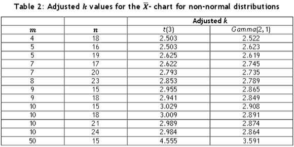
For the OOC comparisons, it was necessary to re-calculate the chart design constant k for the  -chart for the t(3) and the Gamma(2,1) distributions, so that all three charts have the same or nearly the same FAP value (when the process is IC) to ensure a fair OOC performance comparison. Table 2 shows these 'adjusted' k values, which were obtained via simulation. Note that this was not necessary for the nonparametric charts, as their IC performance remains the same for all continuous distributions.
3.2.2.1 Isolated shifts
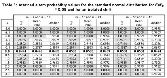
The OOC performance for the isolated shift case was studied for all combinations of m and η in Table 1. However, owing to space constraints we report the results for the combinations: (m, n) = (4,18), (10,24), and (50,15), for the standard normal, t(3), and the Gamma(2,1) distributions respectively in Tables 3 to 5. The chart that performs the best -i.e., detects shifts with the highest probability - is indicated with the use of grey shading. If more than one cell is highlighted, it indicates that the charts are performing similarly. The remaining results are similar. The sample size η did not seem to have much of an effect on the performance, especially since the sample sizes were close to each other. It can be seen that the shift is detected with a smaller probability as the number of subgroups, m, increases. This could be due to the fact that the isolated shift is only observed in the first subgroup. As the subgroup size increases, the impact of the shift becomes watered down as there are more IC observations. Next, for the two symmetric distributions (W(0,1) and t(3)), the direction of the shift did not seem to make a difference with respect to the alarm probability of the charts. From Table 3, it can be seen that the  -chart performs best under the normal distribution, detecting shifts with the highest probability. However, as in the isolated shift case, the mean-rank chart's performance is again seen to be very close to that of the
  -chart. For example, for a shift of δ = 0.5, the mean-rank chart's performance is only 4.83 per cent below that of the
  -chart, and for a larger shift of δ = 1.0, the mean-rank chart's performance is only 2.37 per cent below that of the
  -chart. The median chart detects the shifts with a lower probability. Overall, all three charts seem to perform better for a smaller subgroup size than for a larger subgroup size.
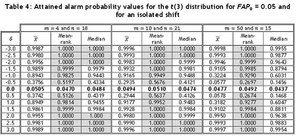
For the t(3) distribution, the control limits for the  -chart were obtained using Table 2. From Table 4, it can be seen that the mean-rank chart detects the mean shifts with the highest probability for a small as well as a large subgroup size. The median chart performs the second best, and the
  -chart shows the poorest results. For m = 50 and η = 15, we see that the median chart at first outperforms the
  -chart, but for larger shifts, the
  -chart seems to reach an alarm probability of 1 faster than the median chart. Again, it is observed that the smaller the subgroup size, the easier it is for the chart to detect the isolated shift.
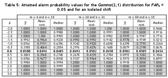
For the Gamma(2,1) distribution, the control limits for the  -chart were again obtained using Table 2. The three charts perform almost equally well for positive shifts when m is small. However, when m = 50, the
  -chart has slightly lower alarm probabilities than the other two charts, which seem to perform almost identically. For negative shifts, however, the mean-rank chart performs the best, with the median chart showing rather low alarm probabilities. The
  -chart performs almost as well as the mean-rank chart. The three charts again perform better when m is small, especially in the case of the median chart, where the performance drops drastically when m = 50. The mean-rank chart shows the overall best performance for an isolated shift, whereas both the median chart and the
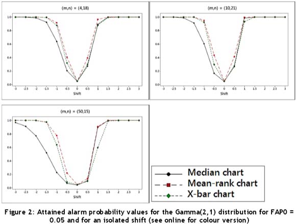
  -chart show some dissatisfactory results. Since the Gamma(2,1) distribution is right-skewed and the interpretations might not be straightforward using Table 5, the attained alarm probabilities are illustrated in Figure 2. Recall that for the two symmetric distributions (N(0,1) and t(3)), the direction of the shift does not make a difference regarding the alarm probability and, accordingly, interpreting Tables 3 and 4 is more straightforward and thus no figures are provided.
3.2.2.2 Sustained shifts
The OOC performance for the sustained shift case was studied for all combinations of m and η in Table 1. Again, as in the case of the isolated shifts, we report the representative results for the combinations: (m,n) = (4,18), (10,24), and (50,15), for the three distributions under consideration, in Tables 6 to 8. It is seen that for the two symmetric distributions (N(0,1) and t(3)), the direction of the shift does not make a difference regarding the alarm probability.

From Table 6, it can be seen that when the underlying process distribution is N(0,1), the  -chart displays the highest alarm probabilities, with the mean-rank chart performing similarly. On the other hand, the median chart detects the shift with a slightly lower probability than the other two charts. For all three charts, it was observed that the probabilities of detecting a shift were higher when m = 50.
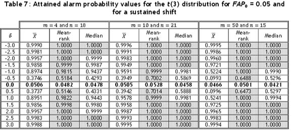
In the case of the t(3) distribution, the control limits for the  -chart were again adjusted using Table 2. As shown in Table 7, all three charts perform similarly for m = 4 to m = 10, with the mean-rank showing the highest alarm probabilities and the
  -chart having the lowest alarm probabilities; but as m increases, the performance of the
  -chart becomes much weaker. The mean-rank and median charts show the highest alarm probabilities for m = 50, although the mean-rank chart still outperforms the median chart.
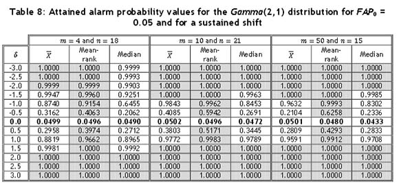
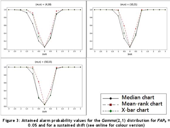
As can be seen from Table 8 and Figure 3 for the Gamma(2,1) distribution, for which the control limits for the  -chart were again adjusted using Table 2, the mean-rank chart shows the highest alarm probabilities for a negative as well as a positive shift. The
  -chart and the median chart perform almost identically for positive shifts, but for negative shifts the median chart shows lower probabilities than the
  -chart. Since the Gamma(2,1) distribution is right-skewed and the interpretations might not be straightforward using Table 8, the attained alarm probabilities are illustrated in Figure 3. Recall that for the two symmetric distributions (N(0,1) and t(3)), the direction of the shift does not make a difference regarding the alarm probability and, accordingly, interpreting Tables 6 and 7 are more straightforward and thus no figures are provided.
Over all the combinations of m and η for the sustained shift, the mean-rank chart shows the highest alarm probabilities, indicating that it will detect a shift faster, with the median chart and  -chart showing less satisfactory results in some instances.
4 REMARKS AND CONCLUSIONS
In this paper we compared the performances of two available nonparametric Phase I charts: the mean-rank and the median chart. Careful consideration was given to the discreteness of the corresponding charting statistics, which can cause the attained FAP values sometimes to be very conservative and much smaller than the nominal FAP value for some number of subgroup-sample size (m,n) combinations. We included the normal theory Phase I  -chart for comparison purposes. It was found that in terms of both IC- and OC performance, the mean-rank and the median charts perform similarly and satisfactorily to the
  -chart when the underlying distribution is normal. However, for heavy-tailed or skewed distributions, the two nonparametric charts both outperform the
  -chart, and there are serious concerns about the IC performance (highly inflated false alarm probabilities) of the
  -chart in these cases. In summary, the considerably better IC performance of the median chart compared with that of the
  -chart for non-normal data outweighs its slightly worse performance compared with the
  -chart in some OOC cases, as the IC performance is deemed to be more crucial in Phase I applications. The mean-rank chart showed the best results overall, and would be the recommended chart to use in practice where the need for a nonparametric chart arises.
Our results make a strong case for using nonparametric Phase I charts in practice, particularly with the computing resources available today. We believe that Phase I control chart research has not received enough attention, since the vast majority of the SPC literature concerns Phase II control charting techniques. Thus further work on Phase I nonparametric control charts would be welcome. More research needs to be done regarding Phase I analysis for small subgroup sizes and even for individual observations because, although traditional SPC applications of control charts involve sub-grouped data, recent advances have led to more and more instances where individual measurements are collected over time.
ACKNOWLEDGEMENTS
This research constitutes part of the first author's Master's dissertation at the Department of Statistics, University of Pretoria. The authors acknowledge support from a South African Research Chair Initiative (SARChI) award. Research of the third author was supported in part by a National Research Foundation grant (Thuthuka programme: TTK20100724000013247, Grant number: 76219).
REFERENCES
[1] Montgomery, D.C. 2013. Statistical quality control: A modern introduction. 7th edition, John Wiley & Sons. [ Links ]
[2] Chakraborti, S., Human, S.W. & Graham, M.A. 2009. Phase I statistical process control charts: An overview and some results. Quality Engineering, 21(1), pp. 52-62. [ Links ]
[3] Jones-Farmer, L.A., Woodall, W.H., Steiner, S.H. & Champ, C.W. 2014. An overview of Phase I analysis for process improvement and monitoring. Journal of Quality Technology, 46(3),pp. 265-280. [ Links ]
[4] Woodall, W.H. 2000. Controversies and contradictions in statistical process control. Journal of Quality Technology, 32(4), pp. 341-350. [ Links ]
[5] Chakraborti, S., Human, S.W. & Graham, M.A. 2011. Nonparametric (distribution-free) quality control charts. In: Balakrishnan, N. (ed.), Handbook of methods and applications of statistics: Engineering, quality control, and physical sciences. New York: John Wiley & Sons, pp. 298-329. [ Links ]
[6] Jones-Farmer, L.A. and Champ, C.W. 2010. A distribution-free Phase I control chart for subgroup scale. Journal of Quality Technology, 42(4), pp. 373-387. [ Links ]
[7] Jones-Farmer, L.A., Jordan, V. & Champ, C.W. 2009. Distribution-free phase i control charts for subgroup location. Journal of Quality Technology, 41(3), pp. 304-316. [ Links ]
[8] Graham, M.A., Human, S.W. & Chakraborti, S. 2010. A Phase I nonparametric Shewhart-type control chart based on the median. Journal of Applied Statistics, 37(11), pp. 1795-1813. [ Links ]
[9] Champ, C.W. & Jones , L.A. 2004. Designing Phase I X charts with small sample sizes. Quality and Reliability Engineering International, 20(5), pp. 497-510. [ Links ]
[10] Gibbons, J.D. & Chakraborti, S. 2010. Nonparametric statistical inference. 5th edition, Boca Raton, FL: Taylor and Francis. [ Links ]

