


Services on Demand
Article
 English (pdf)
 Article in xml format
 Article references
Indicators

Related links
-
 Cited by Google
 -
 Similars in Google
Share

 Permalink
Kronos
On-line version ISSN 2309-9585
Print version ISSN 0259-0190
Kronos vol.42 n.1 Cape Town Nov. 2016
http://dx.doi.org/10.17159/2309-9585/2016/v42a2
ARTICLES
Red textures and the work of juxtaposition
Corinne A. Kratz
Anthropology Department and Institute of African Studies, Emory University Research Associate, Museum of International Folk Art
ABSTRACT
Simon Gush's evocative work Red is an installation, an exhibit, a film, a website, and a provocation to think about what these different forms convey and do, and how they do so. What kinds of engagement, work and knowledge production are involved in curating, designing and creating work in different formats, each of which combines varied media and forms of expression? This article considers the design and interpretive possibilities of Red's different forms, paying particular attention to juxtaposition as a fundamental technique in designing and constructing exhibits, films and websites. The analysis examines the layerings, interactions, timings and textures involved and draws in other exhibitions to highlight the ways that Red and history museums approach their work and relations to time, history and historiography.
Simon Gush's artwork Red has had several incarnations.1 First shown in 2014 at the Goethe Institute in Johannesburg during events reflecting on '20 Years of Democracy' in South Africa, Gush's work focuses on two dramatic events at the Mercedes-Benz plant in East London in 1990, when company relations with labour unions and also relations between unions were in flux. First, when Nelson Mandela was released from prison in February 1990, Mercedes workers decided to make him a car as a gift. Discussions with management produced a plan whereby Mercedes provided parts while workers contributed the labour required. A gleaming red Mercedes 500SE was duly presented to Mandela in July 1990 at Sisa Dukasha Stadium near East London. Second, just a month later, workers began a wildcat sleep-in strike that shut the plant for nine weeks. As a three-room installation at the Goethe Institute's white-cube gallery, Red evoked these events with red Mercedes 500SE body parts mounted on the walls, imagined 'strike beds' and 'strike uniforms' (commissioned from designer Mokotjo Mohulo), and a film by Gush (with James Cairns) shown on a monitor next to the car parts. Gush created a web version of the piece featuring the film and installation photos from Red's first showing and later presented partial installations in Cape Town, Port Elizabeth and Grahamstown, always including the film. In August 2015 the full piece was installed again, this time at the Ann Bryant Gallery in East London itself.2
In terms of general content, Red's different forms and installations may seem the same. Regardless of presentational form or location, there are red Mercedes parts, imagined uniforms and beds made from upholstery, and a long film with contemporary East London scenes intercut with interviews and discussions about the two 1990 events. But the varied embodiments of the artwork-exhibit-installation-film-website Red provide ways to consider modes of knowledge production involved both in designing them and in visitors' interpretive work. From this perspective, presentational forms and combinations matter because design creates different textures and contours through which knowledge production, communication and varied interpretations unfold. In this way, design guides perspectives, shaping particular 'rhetorics of value'.3Considering Red across forms, media and venues has the effect of highlighting contingencies of knowledge and experience and how such contingencies might be shaped by exhibit and website designs themselves.
This article offers close readings of Red as a way to consider design decisions that went into creating the work and interpretive possibilities they in turn produce. Though I focus on design and display, Red's themes and approaches highlight parallel issues facing historians and other scholars concerning multiple perspectives, knowledge production, historical time and representation. At the same time, comparisons across Red's various forms sharpen other questions of interpretation. What's the difference if you can see your reflection in the car door's shiny crimson metal or if you can make the car images smaller or larger on your browser? To watch the film with the intimacy of your own screen, or standing with strangers in a gallery? How, on a website or in an installation, might one 'stretch my time out,... make myself linger over and look more closely'4 at images and objects, or think more deeply about historical events and the twenty years since apartheid's end?
This shift in perceptual pacing is a hallmark of close reading,5 an analytical method that identifies and interprets significant details and patterns in a work's structure, sequences, themes, rhetorics and poetics-aesthetics in order to understand the meanings, associations, contradictions and effects they convey.6 My analysis pays particular attention to juxtaposition as a basic design and construction technique, sometimes incorporating scale differences for emphasis or contrast, or to heighten attention. Juxtaposition also draws attention to thecontingencies, discontinuities and connections central to knowledge production as design choices orient visitors' impressions and understandings. Close reading of design through juxtaposition, then, offers one window onto knowledge production in process.
While this enables a deep dive into the way particular pieces work, the sometimes hermetic, self-referential nature of close reading can render absences and alternatives hard to see. To balance this tendency, I later consider Red through the lens of very different event-centred history exhibits that also foreground labour and unions, the displays at the 9/11 Museum in New York. This also highlights different ways that Red and history museums approach their work and relations to time, history and historiography.
Juxtaposition: Productive Kernels and a Filmic Example
Website and exhibit alike combine and orchestrate different media: objects, images, texts, film, lighting, sound, space. Though the website renders all in two dimensions, its images still convey spatial depth and perspective. The work of Red - the work of producing it, installing it (online or in gallery), and experiencing and apprehending it - fundamentally involves communicative, representational, interactional work. The Red film's accounts of labour relations and negotiations show that communication and interaction can be fraught and consequential. Yet the work of communicative interaction sometimes produces moments of almost transcendent cooperation, as embodied in a 'perfect' Mercedes 500SE danced through the production line in record time, a 'labour of love' emerging with only six faults (compared with the average of 76).7
Website, installation and film all rely on assemblage, montage, and more generally juxtaposition, a versatile technique and resource for design communication and basic building block of film and exhibition design and syntax.8 Fred Wilson has made the technique central to his artistic practice, installing museum collections with startling, provocative, sometimes disturbing juxtapositions that expose the conventions, omissions, and biases of standard exhibits. He says, 'For me, juxtaposition is king. Context is king. Juxtaposition is a wonderful way to get people to understand things without speaking down to them.' His work critiques institutional, social and racial histories to 'effectively disrupt accepted notions of history and 'truth' through site-specific installations ... ridden with allegories, biting humor, critical ironies, and juxtapositions.'9 Wilson uncovers perspectives and assumptions built into museum exhibits by changing the elements and objects typically juxtaposed - the new combinations create the shock. He does not change the basic technique. Indeed his insight is that juxtaposition is a fundamental way that exhibits communicate and create values, meanings and worldviews, and that he can appropriate and redirect it to reveal and question those very processes.
From a design vantage, juxtaposition is a neutral and highly productive technique, a resource that can subtly turn perspectives in many directions depending on its use. Juxtapositions can be productive kernels, starting points for raising questions, telling stories, interacting with and engaging visitors and viewers. For instance, juxtaposed objects or images may show contrast or similarity, helping to make an argument, or sets of objects can imply categories. This means juxtapositions can also provoke questions about assumed categories and taxonomies, suggest their historical contingency and social construction, and intimate other possibilities.10 Alternatively, juxtapositions might be read in terms of sequence and narrative,11 suggesting development, progression or personal stories.12 As potential narrative seeds, juxtapositions begin to suggest larger meanings, relations, and arguments, jump-starting visitors' interpretive work. In the Red film, for instance, cutting between interviews and contemporary outdoor scenes and ambient sound in East London interrupts the historical narratives, linking locations across time and layering memories into the place. As Wilson shows, juxtapositions may also provoke puzzlement or surprise, or seem illogical or out of place on first encounter. Given this rich, varied potential, the 'tensions and paradoxes posed by the act of juxtaposition' are worth attention.13
Artist Simon Gush has worked regularly with juxtapositions that foreground place, time, and notions and practices of labour, exploring that conjunction's 'tensions and paradoxes'. Writing of Johannesburg-based pieces Chávez Mac Gregor says, 'Assuming the responsibility of location, Gush has produced a palimpsest of images and representations to confront labour in 21st century Johannesburg.'14 Palimpsests layer; they hide, erase, obscure and yet reveal through superimposition, juxtaposing different forms and times, earlier and later, through their layers.
In the film Red, images and segments are juxtaposed rather than superimposed, but the sound is sometimes layered like a palimpsest. The opening section before the title illustrates how this counterpoint of images and sound addresses viewers and draws them in, how it begins to tell a story. The film begins with a declaration of time at once very specific and yet unmoored. Visually, a black background with white-lettered audio transcription draws all attention to this temporal setting: 'I think on the 25th of May. Must have been a Wednesday.' What year? Where are we?
Thembalethu Fikizolo then appears, seated in a meeting room, and continues with very specific description of an illegal strike led by NUMSA (National Union of Metalworkers of South Africa). Again, description of place is highly specific but unmoored: '... it started at the F-site, and it moved up, you know, through all the other aspects of the plant, towards the A plant, that's your body shops and paint shops, and it came down towards B plant. B plant was your commercial vehicles assembly, which is where I was working, and I was a constituency shop steward.' We're in some auto plant, but where? When?
The film then cuts to another part of Fikizolo's narration, where time and place are defined through a particular political landscape of labour unions: 'Now, it was before the integration of SAAWU (South African Allied Workers Union) into NUMSA, okay?' He defines the players, their relations, and disputes: NUMSA, a 'militant union' that always had 'industrial actions' and demands, was fighting with SAAWU because they weren't joining the strike. 'And NUMSA was forcefully, violently, you know persuading, if I may use that word euphemistically - persuading SAAWU to join the strike and therefore, they then clashed.'
In less than two minutes we are enmeshed in the 'tensions and paradoxes' of a conjunction of time, place and labour, though it isn't clear where that conjunction lies. At that moment, after Fikizolo first says 'persuading', the film cuts away. A hazy, lingering image of beach and what seems an ocean at low tide appears, cuts to a partial view of a seaside building, to a jetty or buildings on the horizon, to what might be port buildings with a large crane. The images are hazy and held for some time, always with what seems a flat sea and low waves, until a final cut to an empty shoreside pavilion with tall structures for loading ships in the background. For almost two minutes these images cycle as Fikizolo continues his account of labour relations and the strike, now with gentle wave sounds under his narration. He also identifies the plant as Mercedes. After an interlude with Fikizolo on screen, port images are cut in, again layering his account with the ambient sound of waves and a foghorn or ship's horn. Visual alternation continues as the story continues: a failed strike and fighting, a management ultimatum and Fikizolo ultimately dismissed for missing the return to work deadline by minutes. As he falls silent, nearly ten minutes in, the film cuts to its first image of the Mercedes plant, taken from across the street with a truck rattling by. A police car rolls into sight at left and stops. Audio is now only muffled ambient traffic sound and wind across the microphone as the film title RED appears against a grey background, then cuts back to the plant and street. The next interviews, after the title, specify 1988 as the period in narrative focus, and East London as location.
The film's opening segment plunges viewers into a complex, dramatic situation, or at least one participant's story of that situation. While the interview was filmed at roughly the same time as the East London scenes, its content puts us squarely in a narrated past. The East London scenes seem a temporal contrast and at the same time a general atemporality defined by repetitious sounds: waves, traffic, deep honking boats. They juxtapose calm outdoor urban scenes without people (except invisible drivers) with narrated scenes of a plant full of men at work and in heightened interaction - sometimes tense, sometimes jocular.15The aural palimpsest seems to join the two, infusing the larger East London industrial port setting into the story, underlining the distance between when the story is being told and when its events took place, combining and contrasting calming repetitious sounds with the aural landscape portrayed in the narrative and that of the interview itself. This subtly interrupts a naturalised sense of the past, how it is recounted, and the NUMSA perspective Fikizolo offers. It highlights the fact that 'every inhabited landscape is a palimpsest' and particular ways that past and present become enfolded and entangled in contemporary South Africa, whether urban or rural.16 Soon after the title, other interviews and perspectives provide even more sense of the complex dynamics involved.
My point in examining this opening segment is to suggest the layered interpretive process in the production of knowledge, meaning, history and value set off by a small series of juxtapositions in the Red film, details from just one part of the installation.17 When the film is placed on the Red website, juxtaposed with images showing a gallery installation, or placed with objects in gallery space (becoming an object itself as a screen on the wall), it is recontextualised, even as it recontextualises the images and objects. They seem to abstract from the events the film relates in such detail, to bring a stillness to the animated, engaged narrations, much as the contemporary East London scenes do in the film. Perhaps this enkindles a pause to reflect on what those men produced regularly (like the exemplary red 500SE), their working and living conditions then and now, the plant as social and material environment, and how the two events of 1990 are remembered and placed in South African history in this exhibition, twenty-five years later. Perhaps this engenders formal and aesthetic appreciation of the images and objects: the car doors' elegant shape, the garments' patchwork of colour and texture, the images' angles, reflections, shadows and perspectives. How does the film fare in these website and installation conversations and interactions? Such questions call for closer consideration of Red's website and installations, attending to the work of making Red and how design choices might shape visitors' impressions and understandings.
Virtual Tours and Varied Visitors
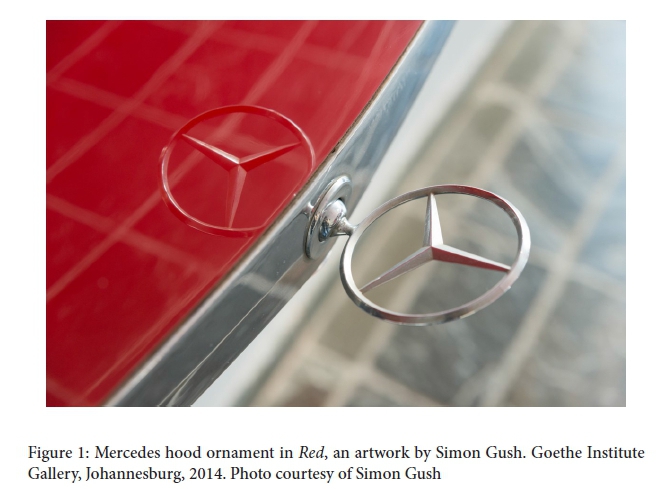
The Red website opens with a dramatic closeup of the Mercedes hood ornament, shot down the hood's edge to double in reflection on the metallic red field (Fig. 1). The Red film lies directly below, slightly smaller, its black and white rectangle sharply contrasting with the red and silver above. The image frozen on screen shows a nighttime dock scene and a comment by Thembalethu Fikizolo: 'girlfriends look at you, the girls admire you working at Mercedes' (film at 58.24). Below the film, 22 colour images are arranged vertically, sized the same as the film and showing Red's Johannesburg installation. Images first show the room displaying red Mercedes components, then move into the room with strike uniforms and strike beds, both using upholstery materials.
At least that was the website design at http://www.simongush.net/red-2/ when I first wrote this, in July 2015. The order and arrangement had differed in January 2015, when I first looked closely at Red's website and made a printout, as did the URL: http://www.simongush.net/works/red/. This now redirects us to the current site, an unrevealed palimpsest obscuring continuing work on Red. An artist's statement about the exhibit began the January website; credits included people in film interviews.18 The film sat below the statement, followed by all 23 images aligned vertically. While following the same general order - car parts, uniforms, beds - only five images held the same position in the sequence in both January and July.19
The Red website translates an exhibit into another form with different design resources for shaping interpretations. Both website versions shadow an actual gallery visit, though they differ, as do visitor experiences. In exhibits, the lighting and texts are design resources that help direct visitors' focus and vision, drawing attention to particular details as they convey content and create rhetorics of value.20 Combined with spatial layout, they help constitute the exhibit paths and narratives.
Words provide initial framing on the January site. The same introductory text is shown in the gallery, taking half a wall next to the Mercedes' boot. It defines the exhibit as examining 'labour relations at the Mercedes-Benz plant in East London, South Africa, in 1990' and describes the two central events. It calls the film a documentary recounting the events through interviews with protagonists, and declares that objects displayed are 'speculative reconstructions of objects from the incident,' 'not historically accurate, but imagin[ing] the possibilities of moments when the factory was appropriated for alternative ideas of what production might be.' The film's interviews provide further verbal and historical framing and reflection on the events.
The opening text eliminates the film's initial temporal ambiguity. Instead, the stated contrast between film and objects introduces questions about history, epistemology and perspective, about accuracy and speculation. This carries on to the January website but is not explicit in the July one. Instead the striking hood ornament image announces the Mercedes focus, its reflected doubling the only suggestion of other layers and perspectives.
The film comes next on both websites. At the same scale as other components, it seems more prominent than in the Johannesburg gallery. Installation images show the film monitor hung at the transition between rooms, next to four car doors. Amidst other objects - some very large and very red - the film recedes, although its movement and sound draw attention. At 82 minutes, the film is long. Website visitors can treat it like a movie, watch straight through, seated comfortably. But in a gallery without benches, visitors may just see snippets. How much, and how, does the film inform visitor understandings in the gallery? Does it matter if visitors see introductory segments or parts about Mandela's car or the wildcat strike?21
A visitor perspective is built into the web's image sequences. The January site seems to walk through the exhibit. We enter with an installation view of the car room, walk round the doorless car body at centre, looking from several angles and distances, then move towards the wall that has four doors and a video monitor, glancing into the next room of strike costumes. Next, five 'hero' shots home in on particular car components with portraits and closeups, emphasising the hood's scarlet expanse. The visitor continues into the next room, glancing back from the first uniform toward the car doors. Looking ahead, we see a line of strike uniforms, walk round them, then look back down the line before two object portraits show the uniforms' beige and white patterns, with fabric ranging from puffy quilting to gauzy netting. Four final images centre on the strike beds: an enclosed installation shot, two closeups highlighting the bed frames' rough metal texture, and a final installation shot from the opposite side, peeking back into the room of red car parts.
The July website moves through the same space, but differently. We enter with the same installation view, but then walk straight to the central car body, closer and closer. It is like meeting the car as a character, looking deep into its headlight eyes. Only then do we back up and walk round it, noting car doors on the back wall. After a good look at the doors in a portrait shot, we turn to hood and boot; four hero shots alternate horizontal and vertical emphases. The final one combines them: the deep red vertically hung hood reflects the horizontal line of doors in its glossy surface. Closing this section, its reflections echo the reflected hood ornament at the start.
Continuing, we look ahead to the strike uniforms, then back again. The earlier website separated these images with object portraits, but now they create a flow that continues with another look down the line of uniforms. Much like encountering the car body earlier, we next confront a kimono-shaped uniform in gentle shades of beige and white. After this portrait, we see it again at the end of the line. We come closer, then encounter an awkwardly assembled uniform in a portrait before turning to the strike beds. Bed images are reversed in this version. The first installation shot looks through to red car parts. Closeups now progress from further away to closer. The enclosed installation image is final, marking an end.
Both websites offer effective gallery tours, but different arrangements and juxtapositions create somewhat different effects. As translations of exhibition into website, they recall the parallel process of translating a text - a significant form of knowledge production and circulation. In this case, design provides the resources for translating and refining both. The January website works with broad image categories: installation shots, then object portraits and closeups for each room. It offers a kind of literal first translation across presentational forms. In translating texts, however, further revision seeks more colloquial, flowing expression that nonetheless maintains the original sense - in effect translating the translation.
The July site's visual sequence has more interesting, varied rhythm. It uses juxtapositions and sequence to present the same images more dramatically, working with scale, perspective and formal relations across images. From the eye-catching opening image and close encounter with the car body to the closed-in space of the final image, it mixes and alternates installation shots with object portraits and closeups. As a second translation, it works more directly with the possibilities of images on a website, for example playing with the way photographs can alter the sense of scale through closeups and angles that direct attention to particular details and imply relations or comparisons. This seems to slow the virtual tour when striking portraits or closeups appear, creating more varied pacing. It offers moments of immersive intimacy with objects that might not be replicable in the gallery itself, even as it mimics and exaggerates but cannot replicate the tactility of actual car parts, uniforms and beds. My reading of these online juxtapositions and sequences animates them into a series, a tour, a narrative that 'connects the discontinuities' between images.22 But they might well be viewed and read otherwise. Exhibit designers and other museum professionals often differentiate visitors as streakers, strollers, and students or scholars, according to the levels of attention, interest and time they invest in an exhibition.23 Similar distinctions surely extend to web visitors, and in this case may apply particularly to visitors' differential engagements with the Red film in relation to objects, gallery spaces and website images.
For the 'student' visitor who watches the full film, or the 'stroller' watching significant portions, the film may provide additional texture, deepen their interpretations and engagements with objects or images, and provoke additional questions. Only the film, for instance, describes the debate about the car's colour and the choice of red as against the old regime's favoured black cars (Philip Groom, film at 37.25). Does this change the way we think of the gleaming red surfaces, the disassembled vehicle? Similarly, we learn from Fikizolo that different production lines wore differently coloured overalls (film at 6.02). In light of this detail, the 'speculatively reconstructed' strike uniforms suggest a unity belied by the film's account of divisions among workers concerning centralised bargaining and the strike. If the website gives the film more prominence and encourages more extended viewing, does it draw attention to questions of epistemology and perspective foregrounded by the opening text? Exhibition and website design and juxtapositions can subtly reframe emphases, orientations and interpretations.
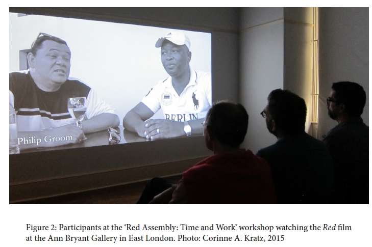
These issues emerged again when Red went to the Ann Bryant Gallery in East London - the same objects installed in very different space. The film was treated quite differently, projected large in a separate, darkened room with chairs (Fig. 2). If the smaller monitor in Johannesburg potentially diminished it, East London presented a fundamental shift in its scale. This enhanced the film and made extended engagement more enticing, evoking a movie theatre experience.24 By creating theatrical space, the film had a stronger presence than being just another object in the form of a screen. The artist's statement (with minor tweaks) was nearby, linking them as essential orientation.
In another significant shift, the film's subtitles were removed, except for speakers' names.25 Larger size and absent subtitles together brought greater attention to the image; details became more noticeable. The East London scenes' stillness and subtle ambient motion were more striking without subtitles unfolding across the bottom. With larger speakers, the ambient sound was also louder. These changes made the Red film an immersive experience, the dramatic narrations of events more immediate. Emerging from the film room, the car parts, uniforms and beds presented sharper juxtapositions that could provoke reflection on the events, narrations and the production of history itself.
In East London those objects were not neatly contained in white cube space. The Ann Bryant Gallery is a 1905 Edwardian building with small rooms. Its very space and architecture brought other histories into the conversation.26 Displayed in three rooms and two entry halls, Red also spilled outside. The car body floated on a stand in the garden, visible through windows and to passers-by. Visual juxtapositions created by sight lines between rooms in Johannesburg, reproduced in website images, altered. From the East London vestibule, all Red's components were visible. But components specific to that gallery joined the mix too: a grandfather clock and classical statue near red car doors, curator's desk by the uniforms. Grill work on the bonnet now echoed grill work on security doors, while bed frames echoed window grills. Patterned terra cotta floor tiles introduced a new red.
Exhibits offer sight lines other than those given on the website. Visitors wander, looking between things, creating constellations of connections and juxtapositions. These expand the constraints of the website's layout and the choreographed representational paths suggested. Web images brought sharp focus to particular details, but the gallery's open visual-spatial paths brought out other aspects and associations among objects. For example, examining the car body in the garden, I was struck not by its smooth, shiny exterior but by the black roughness inside its cavities. These seemed to reach towards the strike bed frames' rough metal textures. Other details personalised pieces almost endearingly, giving them personality - for instance, a black-stained cloth jauntily tucked like a pocket square into one uniform, or its bolt cufflinks (Fig. 3).

We can think about these design changes across venues and forms from several perspectives. Using the same components in each case provides continuity, but continuity is not stasis. From the artist's perspective, shifts may relate to aesthetic imperatives to respond to environment, to make the piece work in different space, for different visitors. Sarah Sze, for instance, adapts her artwork to particular spaces through painstaking placement of material fragments that craft paths and experiences for visitors.27 For visitors, the changes might impel them to slow down, to look and think carefully - particularly if they have seen other versions. New juxtapositions and shifts of scale provide alternative interpretive paths and emphases to engage visitors. More generally, Red's design adaptations demonstrate the active, diverse nature of knowledge production, the role of contextual and formal-aesthetic aspects in shaping it, and the imperative to take neither categories nor conclusions for granted. Though Red is artwork, it contemplates time, history, events and memory, extending these lessons to understandings of them as well.
Exhibitions in Conversation: Work, Place, History
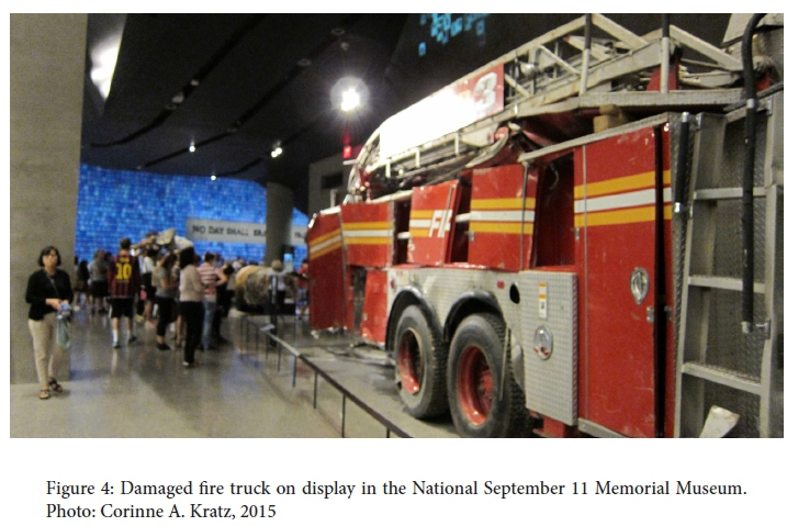
Close analysis of Red's changing design and juxtapositions has shown how they can shape knowledge production and raise certain questions about the events at Mercedes and how histories and memory are produced and presented. It's also helpful to put Red into conversation with other exhibitions to identify other angles and to consider how Red compares to other history displays. Though quite different in size and audience, the 9/11 Memorial and Museum in New York is an effective foil with interesting contrasts and convergences.28 Like Red, it is event-focused and its complex exhibitions address very particular conjunctions of time, place and labour and use some similar techniques. The museum does not display a shiny deconstructed vehicle, but does include a burnt-out red fire truck (Fig. 4). The two also raise parallel questions: how to craft historical accounts of events from multiple perspectives? how to work with scale and orchestrate objects, images, space and sound into effective and affective narratives?29 how to spark imaginative experiences of events and their aftermath and raise questions about what we think we know and how histories are made? I first consider perspectives on work and place in the two, and then consider displays about history.
Unions and labour relations are central to Red; its film offers a strong sense of workers' experience at Mercedes, of the knowledge, patterns and habits of daily working life. The narrative moves outside the plant or union meetings only briefly in the film, when union discussions or strike support occur in community settings or national meetings. These moments sketch the workplace as microcosm of apartheid conditions and the liberation struggle, describing the Sunday Mandela was released and later the event when the vehicle was presented to him. These hint at work-based friendships and domestic lives but maintain focus on the plant and its product. Work is also central to the 9/11 Museum; the World Trade Center (WTC) is its Mercedes plant.30 Everyone there was at work that day and accounts tell how workers in particular companies dealt with the situation together. Beyond WTC workers themselves, stories about police and firefighter companies are prominent. Phrases like 'It was my job' recur.
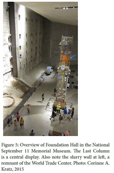
One vast space in the 9/11 Museum, Foundation Hall, tells of the worker community formed during the nine-month site cleanup. Its centrepiece is the Last Column, the final standing steel box beam removed at the end (Fig. 5). Having become a place where workers and family members pasted photos and wrote graffiti in memory of loved ones lost, it received a ceremonial removal that honoured all the trades involved in that work, the rescue workers from earlier phases, and all who perished. The Last Column became an extremely effective vehicle for condensing stories and spanning scales: a 36-foot-high, three-storey, 60-ton structure that carried the hopes and sorrows of friends, brothers, spouses, co-workers.31 Like the Last Column, small dark theatre spaces in the historical exhibits personalise imperilled WTC workers who reached out to family, friends and fellow workers, playing oral histories or poignant phone messages from 9/11 and projecting transcriptions and diagrams identifying their place of work and location within the building that day. In these ways, the 9/11 Museum exhibits stretch into workers' lives, their connections with families and friends, in ways that Red does not.
Clearly, an exhibit's most prominent perspectives will vary both with historical events and with exhibition goals and approaches. Still, the 9/11 exhibits' portrayal of workers highlights Red's relentlessly male perspective and tight focus on the Mercedes plant. The film relates events as remembered by 'protagonists from management and labour' and, as Mteteleni Tshete noted, 'at the time, the plant was having only males' (film at 1.02.49). Race and union affiliation (SAAWU, NUMSA, management) were the most pertinent distinctions made in Red. Nonetheless, one wonders how the events figured outside the plant, how workers' wives, partners, parents and children would narrate them, and what Red would be like if questions of labour and historical imagination were refracted through such perspectives involved with, but oblique to, events. What design shifts and new juxtapositions would be included?
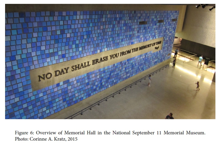
Foundation Hall is balanced by Memorial Hall, a large-scale space that sets the commemorative context with a 100-foot Virgil quote mounted in 15-inch letters forged from recovered World Trade Center steel (Fig. 6).32 Historical exhibitions are situated between them. All these exhibits are located deep underground, at the WTC's original foundation level. It is a cavernous space, charged by its history, the physical remnants and fragments displayed and personalised, fractured moments in time reconstructed. The museum encourages visitors to record memories and reflections, letting the resonant location and exhibits evoke their stories and meditations too. Place is central to the design and effect, a fulcrum joining diverse perspectives, narratives and memories of 9/11's events. Before Red went to East London, place was conjured most strongly in its film. Alternating East London scenes and vivid narrations created a tense fusion of times through place, interwoven with thoughtful reflections on Red's central events. The film built this dynamic into the artwork itself, accommodating showings in different locations. When artwork and place were joined in East London, there was potential to evoke further reflections and responses like the 9/11 Museum's designed grounding through place.
Red's counterpoint with the 9/11 Museum leads to a last question: is Red a history exhibit? The answer is probably yes and no, but the question provides a final consideration of how Red's design frames time, history and historiography. Red is inspired by events in 1990, yet ambiguously claims to be documentary while disavowing historical accuracy. It devotes rooms and part of the film to each defining event at the Mercedes plant, in chronological order. Time is both spatialised and condensed, with the film as hinge between events.
Gallery rooms contrast - polished, red, hard, finished car parts versus soft, oddly shaped white/beige garments and rough, unfinished, corroded metal-bed scaffolding. They underline contrasts between the events brought into spatial-temporal juxtaposition: the cooperative, almost euphoric production of a symbolically resonant car (Köpke, film at 49.50) versus the more ad hoc, divisive wildcat sleep-in strike ending with 500+ dismissals. How does each simultaneously hold the possibility of the other, happening just months apart? Red does not just describe historical events in the factual sense, but through its exhibit design and textures raises questions about their connections. History exhibits might do this too, but would likely do so more explicitly. An artist can more easily 'violate the conventions of history museums, where visitors take for granted linear chronology, literal-mindedness, and strict adherence to documented fact'.33
Red clearly departs from conventional history exhibits in its treatment of objects. A canonical design feature of history exhibits is pairing an object with text featuring tight provenance 'showing an object's direct association with a particular person, moment, or event'.34 Such juxtapositions create indexes of historical authenticity, often highlighted to draw visitors. One example appeared in another 'Red' exhibit, shown at the Museum of International Folk Art. 'The Red That Colored the World' was a comprehensive exhibit about cochineal, 'a tiny scaled insect that produces carminic acid', for centuries the 'most prolific and enduring source' of red in paintings, textiles and other objects.35 To recount cochineal's global spread and astonishing range of uses,36 the exhibit assembled an impressive array of objects, many loaned by renowned institutions. Their historical provenances and collection pedigrees combined to magnify and attest to their genuineness and value.37 For instance, one of Napoleon's chairs, loaned by the New York Historical Society, was labelled:
This is one of twenty-eight chairs made for the room in which Napoleon Bonaparte assembled his cabinet at Malmaison, the primary residence he shared with his wife Josephine during the consulate period, which ended in 1804. The deep red cochineal-dyed upholstery was intended to reinforce the image of power that the first consul consciously projected through his every act and accouterment. Red was closely associated with the power of the ancient Romans, and the chair's red wool and silver trim may have been meant to evoke a military uniform.
By contrast, the South African Red labels objects in the terse art exhibit style: artist, title, materials, date. More fundamentally, the artist's statement claims documentary status for the film and direct connection to the 1990 events through protagonists interviewed, but eschews the notion of authenticity in relation to objects in the gallery. In fact, his statement explicitly says they are not 'historically accurate' but rather 'speculative reconstructions of objects from the incident' through which to imagine historical contingencies and possibilities.
Intended as artwork, Red is at once a historical and contemporary reading. It recounts historical events at the Mercedes plant from the vantage of 2014-2015, 25 years later. Most history exhibitions have such multi-temporal stances simply by virtue of addressing visitors in the present, though they may not foreground the historiographical questions this entails. Similarly, other contemporary artists create archives, restage historic events and use history display styles to 'create a dialogue with historic figures, movements, and events,... [taking history as] a subject to be challenged, re-written, or recreated,... [or as] a source of inspiration and creative energy'.38Red uses and plays with conventions of history exhibits, but its components bring a spirit of contingency, fragmentation and imagination to history and knowledge production, constructing a relational history39 that suggests a series of possible histories and questions about historiography and our relation to history and memory.
Each component of Red signals this, in part, by showing its seams. The Mercedes parts are polished and enticingly red, but the car itself? Unfinished, disassembled/unassembled, and without automotive guts to make it work.40 Could the parts be put together or put to use in other ways? The strike uniforms literally show their seams, with a cushion jutting from a shirt or oddly-placed sleeves - interesting, but ungainly as actual garments. And those beds - could someone sleep in them, really? The mattresses curl, and their thin wooden platforms seem weakly anchored on the rough metal frames. Nothing is 'finished'. All raise questions about how things are put together and what we expect or take for granted in ordinary objects.
Oral history anchors the film's interactive narration across interviews, from different perspectives. It echoes interactions between and within sides at the time and shows seams and splits as they describe volatile, contingent situations. How else could things have gone? This question comes up as protagonists reflect on events and alternative outcomes. How else could the histories be put together and narrated? How are memories formed, disassembled, reassembled? Contemporary scenes intercut with the interviews draw attention to these questions and to the cross-temporal mix of the film and interviews. They exaggerate the seams of film editing, story telling and remembrance alike with images and sounds that are incongruous yet somehow connected, woven together through overlapping audio. The intercut scenes themselves combine stillness and movement, 'denaturalising conventional visual experience' to foreground and blur distinctions between film and still photography.41
Just as Red shows its seams, the 9/11 Museum also incorporates rough structural fragments - the coarse slurry wall that held the Hudson River back even after the WTC collapsed, excavated remnants of North and South Tower foundations, and more (Figs. 5 and 7). But those fragments seem more to convey the ingenuity of construction, the force of destruction, and (in the slurry wall) a symbolic 'power of resurgence.'42Red's fragmentations are deliberate, created, not simply selected and curated. Their counterpoint builds through the juxtaposition of events, objects, and images as visitors explore the website, peruse the exhibit and watch the film. Together they define a framework for thinking not only about specific events, but about what is at stake in the ways histories are made and remembered in the post-apartheid present and how trajectories of time, place and labour link past and present.
The Conceptual-Aesthetic Work of Design and Interpretation
Reading and re-reading different forms and components of Simon Gush's Red has been a means to explore both the conceptual-cum-aesthetic work involved in making art and designing exhibitions and websites, as well as the interpretive work involved in producing knowledge, meaning and value through art and exhibitions. Juxtapositions offer one basic, highly productive design resource for both. Diverse juxtapositions enable artists, curators and designers to create formal patterns and relations, develop themes, and craft persuasive forms and commentaries on various topics and issues. They create interpretive possibilities to which different visitors bring their own experience and expectations. The interaction among artists, curators, designers and visitors through art, exhibits and websites is one source of those 'tensions and paradoxes posed by the act of juxtaposition',43 one way critical questions are raised. Raising searching questions is fundamental to the production and transformation of knowledge, value, and social engagement.
Considering the work of juxtaposition in Red and seeing it through other exhibitions was a way to slow down and linger over its structure, syntax, details and effects. This drew attention to the combination and interplay of the work's aesthetic, material and spatial aspects with its political and social aspects. For some visitors, that interplay may lead to insights and questions about how histories are written, how past and present constitute one another, the role of labour in post-apartheid South Africa, and 'what production might be' (artist's statement). For others, alternative dimensions will be prominent. Similar variations and design concerns are part of the diverse ways that histories are produced, presented and understood.
Looking at the Red website, watching the Red film, and visiting the Red installation enkindle different timings, pacings and kinds of attention as distinct presentational forms recontextualise Red's components. One curator of the other Red installation noted, 'Red is the power color ... red has an emotional draw, a material draw, and an inspirational draw, and all the ideas it stimulates have to do with emotion and power and love and life'.44 Simon Gush's Red deftly turns that power to creative and critical effect, affording ample opportunities for reflection, dialogue and debate.
1 This paper was first written when I was a Heilbrun Distinguished Fellow. Aubrey Graham, Clark Hulse, Carolyn Hulse and Kronos reviewers provided welcome feedback on initial drafts.
2 This installation was in conjunction with 'Red Assembly: Time and Work', the African Critical Inquiry Programme's 2015 workshop. Afterwards Gush donated the artwork to the University of Fort Hare collection, returning it to the region that inspired it.
3 C. Kratz, 'Rhetorics of Value: Constituting Worth and Meaning through Cultural Display', Visual Anthropology Review, 27, 1, 2001: 24-48. [ Links ]
4 M. Gorra, 'Deep into Green', New York Review of Books, 25 September 2014. http://www.nybooks.com/articles/archives/2014/sep/25/deep-green/, accessed 20 September 2014.
5 J. Raban, 'Summer with Epson', London Review of Books, 31, 21, 2009, 4/12. http://www.lrb.co.uk/v31/n21/jonathan-raban/summer-with-empson, accessed 6 July 2016.
6 Close reading combines formal and contextual analysis to interpret patterns and connections that visitors might follow, but it does not survey visitors' interpretive range and variation.
7 Russell, Tshete, Köpke, and Groom interviews in S. Gush and J. Cairns, Red (East London, 2014), 37.00-45.00.
8 Art historians credit William Seitz's 1961 exhibit 'The Art of Assemblage' with drawing attention to artistic methods that involved deliberate 'juxtaposition of found elements' and sought to 'defy and obliterate accepted categories'. Gaining prominence in the 1950s, they had deeper roots in modernist movements including Dada, Surrealism and Cubism. In the 1950s-60s they interconnected with Levi-Strauss's developing notion of bricolage and Happenings, early performance art characterised as 'art of radical juxtaposition'; assemblage was also 'presented as the close cousin of collage'. J. Kelly, 'The Anthropology of Assemblage', Art Journal, 67, 1, 2008; S. Sontag, 'Happenings: An Art of Radical Juxtaposition' in Susan Sontag, Against Interpretation (New York: Farrar, Straus, 1962), 263-74.
9 J. Lusaka and J. Strand, 'Fred Wilson: Learning to Speak Museum', Museum News, 85, 1, 2006, 49; [ Links ] S. Hassan, 'Fred Wilson's Black Venezia' in Salah Hassan, Paul Kaplan, Fred Wilson, Kathleen Goncharov and Jane Farver, Speak of Me as I Am (Boston: MIT List Visual Arts, 2003),38. [ Links ]
10 Contemporary displays that recreate Enlightenment-era exhibits may play a similar role, bringing attention to the very act of creating categories and taxonomies. See B. Lord, 'Representing Enlightenment Space' in Suzanne Macleod (ed), Reshaping Museum Space: Architecture, Design, Exhibitions (London: Routledge, 2005), 146-57; [ Links ] B. Lord, 'Foucault's Museum: Difference, Representation, and Genealogy', Museum and Society, 4, 1, 2006, 6; [ Links ] T. Bennett, 'Exhibition, Difference, and the Logic of Culture' in I. Karp, C. Kratz, L. Szwaja, T. Ybarra-Frausto (eds) with G. Buntinx, B. Kirshenblatt-Gimblett and C. Rassool, Museum Frictions: Public Cultures/Global Transformations (Durham: Duke University Press, 2006), 63. [ Links ] Pinney highlights photographic practices that use formally similar images to create typologies and classes of people or to emphasise individual dignity and strength. See C. Pinney, 'The Quick and the Dead: Images, Time and Truth', Visual Anthropology Review, 6, 2, 1990, 47. [ Links ]
11 Kratz, 'Rhetorics of Value', 29. See also M. Bal, Double Exposures: The Subject of Cultural Analysis (New York: Routledge,1996),87-90; [ Links ] J. Berger, 'Stories' in John Berger and Jean Mohr, Another Way of Telling (New York: Pantheon, 1982); [ Links ] and N. Thomas, 'The Museum as Method', Museum Anthropology, 33, 1, 2010, 6-10. [ Links ]
12 While the narratology of exhibition design may start with juxtapositions, it relies on visitors building meaning and connection across discontinuities. Berger notes, 'All stories are discontinuous and are based on a tacit agreement about what is not said, about what connects the discontinuities.' He focuses on sequences in photo essays, where juxtaposition is the key mode of construction. Berger, 'Stories', 285-6.
13 I. Karp, 'Real Objects, Simulated Experiences and Cultural Differences: Paradox and Tensions in the Making of Exhibits', South African Museums Association Bulletin, 25, 2, 2001, 75. [ Links ]
14 H. Chávez Mac Gregor, 'Let There Be Light' in Sophie Perryer (ed), Simon Gush: Work (Johannesburg: Stevenson, 2014), 2. http://issuu.com/stevensonctandjhb/docs/simon_gush_work_issuu, accessed 18 July 2015. [ Links ]
15 The East London scenes bring a certain stillness, in part because they are held for ten or twenty seconds, some close to a minute, with no camera pans, zooms or other motion. The camera is still and motion only what occurs in the scene: waves, cars passing, people crossing streets, wind in the trees and so on. Thus, it records ambient motion that matches the ambient sound, creating segments somewhere between film and still image. Pinney, 'The Quick and the Dead'.
16 Raban, 'Summer', 6/12. See also D. Bunn, 'The Museum Outdoors' in Karp et al, Museum Frictions, 357-91. [ Links ]
17 Those creating exhibits or artworks may not fully appreciate or anticipate this complex potential while they make them because visitors are the missing ingredient. Visitors bring diverse experience, knowledge and expectations, as well as plural, contradictory identities and subject positions to the mix, sparking varied interpretations and associations. C. Kratz, The Ones That Are Wanted: Communication and the Politics of Representation in a Photographic Exhibition (Berkeley: University of California Press, 2002), 94; C. Kratz, 'What Makes Exhibitions Ethnographic?', paper presented at 'The Future of the Ethnographic Museum' conference organised by the Pitt Rivers Museum with the Ethnography Museums and World Cultures Project, Oxford, UK, 19-21 July 2013, 35.
18 The statement is still on a few sites associated with the 2014 Johannesburg installation: http://www.wherevent.com/detail/Goethe-Institut-Sudafrika-Red-by-Simon-Gush-Film-Screening, https://www.facebook.com/events/468506466582724/permalink/481427385290632/ and http://www.dramaforlife.co.za/news/entry/red-by-simon-gush-at-the-goethe-insitut, all accessed 13 December 2015.
19 The version of this article circulated for the 'Red Assembly' workshop compared the two sequences in detail. The site had changed again by December 2015, eliminating the dramatic first image.
20 Kratz, 'Rhetorics of Value', 34-5.
21 The film has three sections: 1) a half hour of background on difficult labour relations, strikes and stoppages in the 1980s, setting the scene and introducing speakers; 2) roughly twenty minutes on producing Madiba's car, presenting it to him and delivery to Johannesburg with a shop stewards' escort; 3) a final half hour returning to labour relations, the issue of centralised vs plant bargaining that provoked the wildcat strike, and the full strike process, misunderstandings and divisions. Transitions between parts are marked narratively, but also by brief sections where interviews fall silent and the soundtrack is only ambient sound from East London scenes, as during the initial title.
22 Berger, 'Stories', 285-6.
23 G. MacDonald, 'Change and Challenge: Museums in the Information Society' in I. Karp, C. Kreamer and S. Lavine (eds), Museums and Communitites: The Politics of Public Culture (Washington DC: Smithsonian Institution Press, 1992), 166-8. [ Links ] Other ways to characterise visitor differences have drawn on shopping or animal metaphors. L. Kelly 'Categorising visitors?', Australian Museum blog, 2009, http://australianmuseum.net.au/blogpost/museulaneous/categorising-visitors, accessed 29 July 2015. Associated with the streaker/stroller/student distinction is the 3-30-3 rubric for text design that creates a hierarchy of information: visitors should be able to grasp the basic topic in three seconds, the main idea and themes in thirty seconds, and read a label panel in three minutes.
24 For some, however, the separate space might marginalise the film.
25 Simon Gush told me they were included in Johannesburg partly because it was hard to hear; sound levels had to be limited.
26 The East London location was also significant. See Helena Pohlandt-McCormick, Gary Minkley, John Mowitt and Leslie Witz, 'Red Assembly: East London Calling', parallax, 22, 2, 2016, 126-7. [ Links ]
27 R. Pogrebin, 'Sarah Sze Aims for Precise Randomness in Installing Her Gallery Show', New York Times, 23 August 2015, C1. [ Links ]
28 The official name is the National September 11 Memorial Museum, although the US government provides no support. http://www.911memorial.org/public-private-partnership, accessed 28 July 2015.
29 The 9/11 exhibits work across huge scalar range, from massive objects (such as twisted girders) to scraps of paper and ephemera. Its website claims, 'The monumental artifacts of the Museum provide a link to the events of 9/11, while presenting intimate stories of loss, compassion, reckoning, and recovery' (http://www.911memorial.org/about-museum, accessed 30 July 2015).
30 The Pentagon also figures as workplace and target, but the WTC is more prominent.
31 http://cityroom.blogs.nytimes.com/2009/08/24/steel-column-a-911-survivor-returns-to-ground-zero/, accessed 30 July 2015.
32 It reads, 'No day shall erase you from the memory of time.' The letters were forged by the artist-blacksmith Tom Joyce. http://adobeairstream.com/art/writing-on-the-wall-tom-joyce-fabricates-for-the-national-september-11-memorial-museum/, accessed 31 July 2015.
33 K. Yellis, 'Fred Wilson, PTSD, and Me: Reflections on the History Wars', Curator, 52, 4, 2009, 341.
34 Kratz, 'What Makes Exhibitions Ethnographic?', 23.
35 http://www.internationalfolkart.org/exhibitions/current.html, accessed 17 July 2015.
36 Cochineal became second only to silver as a source of Spanish imperial revenue. It coloured Peruvian garments, 19th-century British redcoat uniforms, 18th-century paintings, 19th-century Lakota blankets, varnish on Stradivarius violins, 18th- and 19th-century Japanese firefighters' coats, lipstick and other cosmetics, couture garments, and once provided pink for Starbucks' Strawberry and Creme Frapuccino.
37 Curators went further by testing each object to verify cochineal's presence, combining art, science, history and culture to tell effective stories and construct a laminated, multidimensional presentation of evidence, accuracy and authenticity.
38 'Agitated Histories', exhibition held at SITE, Santa Fe, 2011-2012, http://sitesantafe.org/exhibition/agitated-histories/, accessed 3 August 2015.
39 Kratz, 'What Makes Exhibitions Ethnographic?', 13.
40 Pohlandt-McCormick et al see this as emphasising 'differences, divisions, conflicts, dissension, disassembling, undoing' that challenge a common purpose. 'Red Assembly', 124.
41 Pinney, 'The Quick and the Dead', 43.
42 See http://archidose.blogspot.com/2014/06/a-visit-to-911-museum-part-2.html and http://www.nytimes.com/2013/09/12/nyregion/looking-to-a-wall-that-limited-the-world-trade-centers-devastation.html?, both accessed 5 August 2015.
43 Karp, 'Real Objects', 75.
44 Padilla quoted in L. Daly, 'Red', El Palacio, 120, 2, 2015, 30-5.

